Wes Anderson Interior Design: How to Recreate the Iconic Aesthetic at Home
A practical guide to Wes Anderson interior design — symmetry, pastel palettes, vintage furniture, and how to recreate the look in your own home, even on a budget.
Few directors have made interiors as instantly recognizable as Wes Anderson. From the candy-pink corridors of The Grand Budapest Hotel to the layered, lived-in apartments of The Royal Tenenbaums, his films treat rooms as carefully composed paintings — every object in its place, every color chosen on purpose. Wes Anderson interiors have become a design language of their own: symmetrical, pastel-tinted, vintage-soaked, and quietly playful.
The good news is that this look is easier to bring home than you might think. You don’t need a film budget or a 1970s townhouse. You need a clear color palette, a few well-chosen vintage pieces, and the patience to arrange them with intention.
If you love how movies shape our taste in interiors, you might also enjoy our take on pop culture interior design and our wider movie interior inspiration gallery.
What Defines a Wes Anderson Interior?
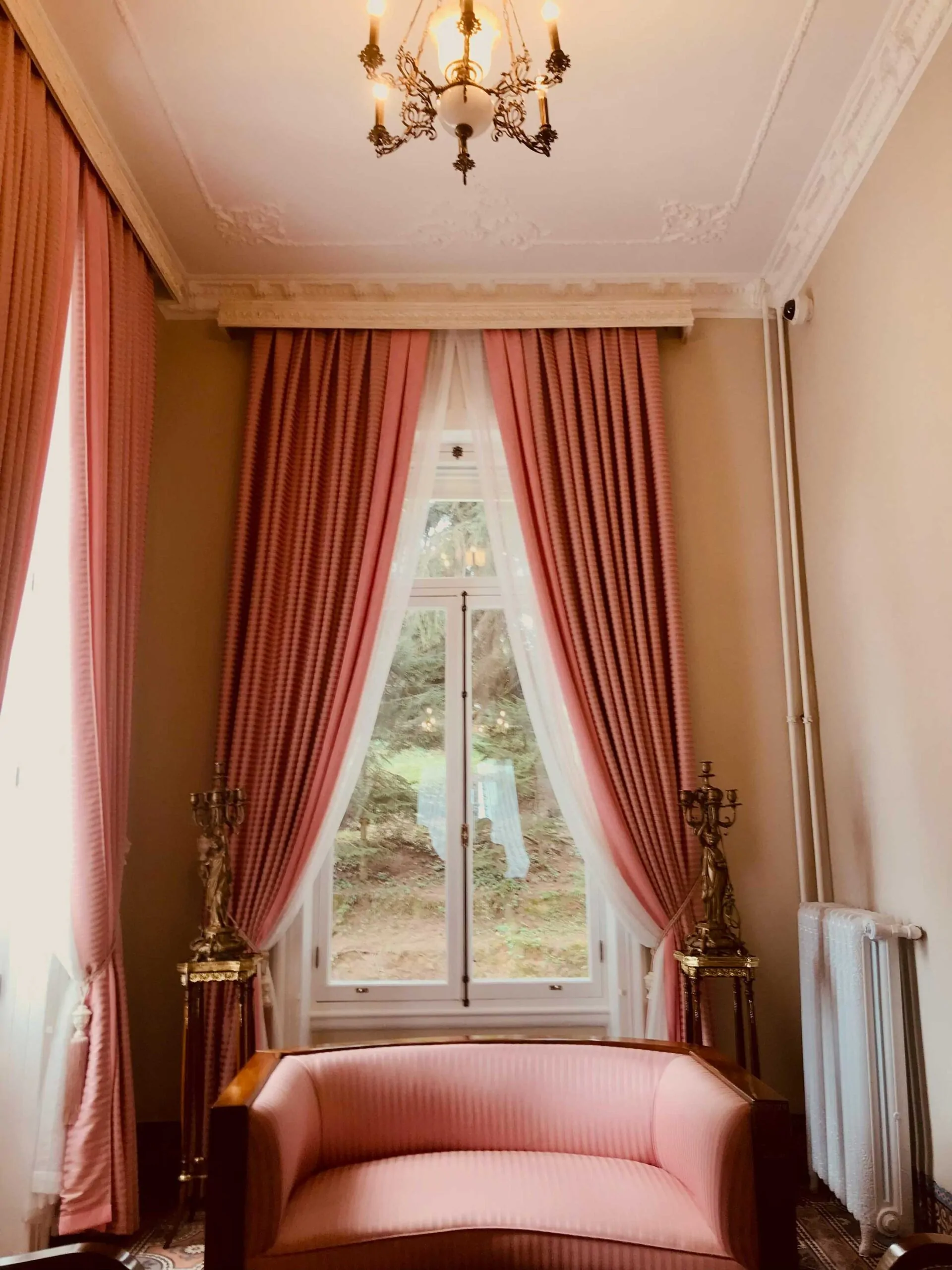
Symmetry and color discipline give small rooms a strong visual identity
Anderson’s interiors are built on a handful of repeating principles that show up across nearly every film. Recognizing them is the first step to recreating them.
Strict symmetry. Beds centered between two matching lamps. Sofas flanked by identical side tables. Artwork hung in perfect grids. The frame of a Wes Anderson room almost always invites your eye straight to the middle, then lets it travel outward in mirror-image steps.
Soft, faded, and slightly unreal color palettes. Salmon pink, mustard yellow, sage green, butter cream, dusty teal, and burgundy red — colors that look like they’ve been pulled from an old postcard. Anderson rarely uses pure white; even his neutrals lean warm and aged.
Layered vintage objects. Books, framed photographs, taxidermy, brass lamps, embroidered cushions, suitcases, typewriters, telescopes, miniature globes. Every surface holds a curated collection that feels both eccentric and meticulously cataloged.
Maximalism with discipline. A Wes Anderson room is full — but never chaotic. Each object earns its spot. Clutter is an aesthetic choice, not an accident.
A sense of nostalgia. Anderson’s interiors evoke a past that may have never existed — part 1960s Manhattan, part European grand hotel, part summer camp. The result feels timeless rather than dated.
Symmetry, Balance, and Cinematic Framing
Symmetry is the backbone of Anderson’s signature look. We feel instantly calm when objects mirror each other across a central axis. It’s like stepping into a living diorama — everything feels right where it belongs. Anderson’s planimetric compositions flatten depth so walls, floors, and furniture align in parallel planes. As Indie Film Hustle points out, his widescreen shots rely on meticulous object placement and balanced framing (Indie Film Hustle).
Framing and Balance
Each frame in a Wes Anderson film is a study in precision. Objects, art, and furniture line up with architectural details. That flat, proscenium-style arrangement draws our eye to the heart of the room — whether it’s a portrait, a fireplace, or a bold piece of seating.
Mirrored Furniture Layouts
Mirrored seating instantly grounds a space. Try pairing identical chairs on either side of a console table. Hang two matching sconces above a mantel. Place twin rugs beneath a symmetrical sofa arrangement. That mirrored approach gives a feeling of order and calm without feeling cold.
Iconic Wes Anderson Films and Their Interiors
Each of Anderson’s films offers a distinct interior reference. Pulling from the right one helps you focus your own design choices.
The Grand Budapest Hotel (2014). The most-referenced film for interior inspiration. Pink lobbies, red elevators, gold trim, herringbone floors, neoclassical molding, and an obsession with grand European hotel detailing. If you love drama and saturation, start here.
The Royal Tenenbaums (2001). A more lived-in, layered look. Warm wood paneling, leather chairs, deep red walls, vintage games, family portraits, and rooms full of personal history. Best suited for studies, libraries, and family living rooms.
Moonrise Kingdom (2012). Earthier, summer-camp-inspired. Khaki, forest green, mustard, and rust. Stripes, badges, scout maps, brass binoculars, leather-bound books. A great reference for kids’ rooms, cabins, or weekend homes.
The French Dispatch (2021). Print-shop chic. Saturated yellow, ink black, and faded newsprint tones. Anderson’s most graphic film — heavy on typography, posters, and editorial layouts. Excellent inspiration for a home office or creative workspace.
Asteroid City (2023). Mid-century motel desert palette. Pale turquoise, sun-bleached terracotta, butter yellow. A more minimal Wes Anderson take, ideal for those who want the symmetry and palette without the maximalist clutter.
The Wes Anderson Color Palette
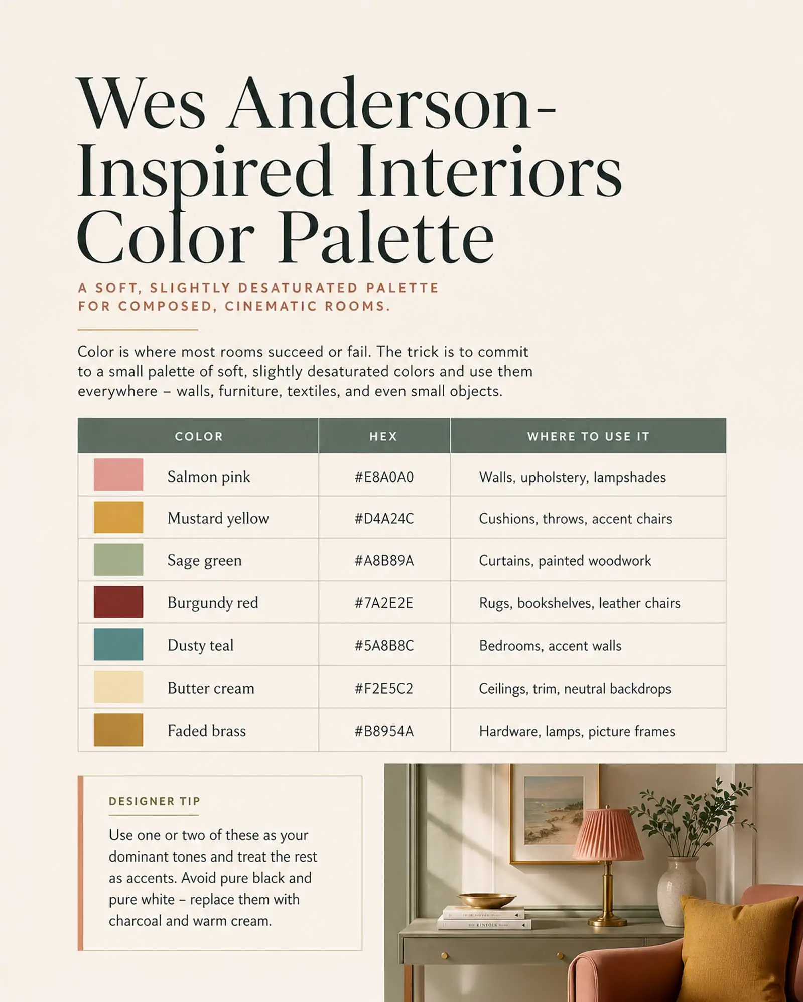
Use a small palette of soft, slightly desaturated colors and use them everywhere
Color is where most Anderson rooms succeed or fail. The trick is to commit to a small palette of soft, slightly desaturated colors and use them everywhere — walls, furniture, textiles, and even small objects.
| Color | Hex | Where to Use It |
|---|---|---|
| Salmon pink | #E8A0A0 | Walls, upholstery, lampshades |
| Mustard yellow | #D4A24C | Cushions, throws, accent chairs |
| Sage green | #A8B89A | Curtains, painted woodwork |
| Burgundy red | #7A2E2E | Rugs, bookshelves, leather chairs |
| Dusty teal | #5A8B8C | Bedrooms, accent walls |
| Butter cream | #F2E5C2 | Ceilings, trim, neutral backdrops |
| Faded brass | #B8954A | Hardware, lamps, picture frames |
Use one or two of these as your dominant tones and treat the rest as accents. Avoid pure black and pure white — replace them with charcoal and warm cream.
Color by Film: How Each Palette Sets a Mood
Each Anderson film carries its own hue-driven identity. These palettes aren’t just pretty pictures — they guide how we feel in each scene.
| Film | Dominant Palette | Feeling |
|---|---|---|
| Fantastic Mr. Fox | Neutral browns | Cozy warmth |
| The Royal Tenenbaums | Reds and magentas | Eccentric drama |
| Moonrise Kingdom | Mustard yellows and teal | Nostalgia |
| The Grand Budapest Hotel | Pinks and golds | Theatrical romance |
As Invaluable notes, these choices shape our emotional response on screen (Invaluable). We love how a single color can anchor an entire space — and the same logic applies at home.
Consistent Color Blocking
Here’s a handy trick to keep an Anderson palette from feeling chaotic at home:
- Pick one main hue and one accent shade.
- Paint an entire wall or ceiling in your primary color.
- Add small bursts of the accent through pillows, vases, or trim. That keeps the look cohesive and playful instead of busy.
Furniture and Decor Choices
Anderson’s rooms are full of pieces that look like they’ve been collected over decades, even when the film took six months to shoot. Hunting them down is half the fun.
| Item | What to Look For | Where to Find It |
|---|---|---|
| Velvet armchair | Tufted back, wooden legs, faded jewel tones | Estate sales, vintage shops, Etsy |
| Brass floor lamp | Adjustable arm, fabric shade, patina finish | Flea markets, eBay, Schoolhouse |
| Vintage rug | Persian or kilim, muted colors, slightly worn | Rug auctions, Revival Rugs, secondhand |
| Wooden writing desk | 1950s–1970s, drawers, brass pulls | Antique stores, Chairish |
| Leather-bound books | Matched sets, faded spines | Used bookshops, AbeBooks |
| Botanical prints | Framed in gold or brass, hung in grids | Vintage print sellers, Society6 |
| Embroidered cushions | Cross-stitch, monograms, geometric patterns | Etsy, Anthropologie, vintage |
| Glass display cabinet | Painted wood frame, brass hardware | Antique malls, IKEA hacks |
Layer Vintage Textures
Texture is what makes a Wes Anderson room feel real. It invites touch, curiosity, and comfort — and it’s where most people stop short of the full effect.
Wallpaper and Patterns
Bold wallpaper is a go-to Anderson move. Think diamond motifs in The Darjeeling Limited or floral prints in Rushmore. Two rules of thumb:
- Commit to one feature wall and keep the others neutral.
- Mix a large-scale pattern with subtle, smaller prints. Emily Hadley shows how playful wallpaper can transform any room (Emily Hadley).
Mixed-Era Furniture
One antique chair plus one modern sofa tells a layered story. Combinations we love:
- Mid-century cabinets with contemporary lighting.
- Retro TV consoles alongside sleek sideboards.
- Worn rugs over polished oak floors. Art Departmental reminds us that blending decades brings warmth and intrigue (Art Departmental).
How to Style a Room Wes Anderson-Style
Recreating the look is less about buying new things and more about how you arrange what you have. Work through the room in this order.
Step 1: Pick your film reference. Decide which Anderson film matches the room’s purpose. A library leans Tenenbaums. A guest room leans Grand Budapest. A child’s bedroom leans Moonrise Kingdom. Stay disciplined — mixing references usually flattens the effect.
Step 2: Commit to two or three colors. Pull three colors from the palette table above and use them across walls, textiles, and large furniture. Resist the urge to add a fourth.
Step 3: Center everything. Identify the focal point of the room — a bed, a fireplace, a sofa. Place it dead center on its wall. Flank it with identical pairs: matching lamps, matching side tables, matching plants. Symmetry does most of the heavy lifting.
Step 4: Build a curated collection. Choose one display surface — a bookshelf, a mantel, a console — and fill it with objects that share a theme: vintage cameras, brass instruments, framed black-and-white photos, glass paperweights. Group in odd numbers and arrange by height.
Step 5: Hang artwork in grids. Wes Anderson rarely hangs a single painting. He hangs nine, in three rows of three, all matching frames, all centered above a piece of furniture. If you have wall space, this is the highest-impact move you can make.
Step 6: Layer textiles. Add a vintage rug. Drape a velvet throw over the chair. Stack embroidered cushions. Use linen drapes that pool slightly on the floor. Texture is what keeps the room from looking like a stage set.
Step 7: Light it warmly. Skip overhead lighting. Use multiple table lamps, floor lamps, and wall sconces with warm 2700K bulbs. Anderson’s films almost never use cool white light.
Tell Stories with Your Decor
Anderson’s sets are more than pretty rooms — they’re narrative devices. Every object whispers backstory. Remember the pink princess phone in The Royal Tenenbaums? It embodies Margot’s longing and whimsy. Each prop is handpicked to echo character and theme.
We can borrow that idea at home:
- Display a vintage map from a favorite trip.
- Hang a botanical print that sparks curiosity.
- Showcase a childhood memento on a floating shelf.
- Frame a handwritten letter, a concert ticket, or an old passport page.
The trick is restraint. Choose one standout piece — a bold armchair, an ornate mirror, or a graphic rug — and let it act as the room’s storyteller. The rest of the décor supports the narrative rather than competing with it. Just like Monica’s apartment in Friends apartment decor, the goal is to hide clutter while keeping personality front and center. For more on subtle cinematic nods done well, see our deep dive on Mad Men interior design.
Wes Anderson on a Budget
Remember, paint is the cheapest transformation
You don’t need a vintage fortune. The look rewards patience over price.
Paint is the cheapest transformation. A single can of Farrow & Ball–style pink or sage green will do more than a sofa change. Test small swatches first — Anderson colors often look very different in person than online.
Estate sales and thrift shops are your best friends. Velvet chairs, brass lamps, leather-bound books, and framed botanical prints all turn up for under $50 in most US cities. Hunt weekly rather than monthly.
Mix high and low. A $30 thrift-store armchair reupholstered in mustard velvet ($120 in fabric) reads more “Wes Anderson” than a $2,000 designer piece. The aesthetic is built on character, not luxury.
IKEA hacks work surprisingly well. A plain BILLY bookcase painted in dusty pink with brass knob upgrades looks remarkably Andersonian. Search “wes anderson IKEA hack” for community guides.
Don’t overshop. Anderson rooms feel collected, not bought. Add one piece at a time, live with it for a few weeks, and only continue when you know what’s missing.
Frequently Asked Questions
What design style is Wes Anderson?
Wes Anderson interiors blend mid-century modern, vintage European, and 1960s–1970s American maximalism. There’s no single label — it’s more a sensibility built on symmetry, pastel palettes, and curated clutter.
What colors does Wes Anderson use?
His signature palette includes salmon pink, mustard yellow, sage green, burgundy red, dusty teal, and butter cream. He rarely uses pure white or pure black, preferring warm aged neutrals.
Which Wes Anderson film has the best interiors?
The Grand Budapest Hotel (2014) is the most cited for interior design inspiration thanks to its grand hotel sets. The Royal Tenenbaums (2001) offers a more livable reference for everyday homes.
How do I make my house look like Wes Anderson?
Pick one film as your reference, commit to two or three palette colors, arrange everything symmetrically, hang art in grids, and layer vintage objects on every surface. Symmetry and color discipline matter more than specific furniture.
Is Wes Anderson style still trendy in 2026?
Yes. Anderson’s aesthetic has cycled from niche to mainstream and become a long-lasting reference point in interior design. Pinterest searches for “Wes Anderson interior” remain consistently high, and the style continues to influence everything from boutique hotels to home decor brands.
Can Wes Anderson interiors work in a small apartment?
Absolutely — and arguably better than in a large home. Anderson’s symmetry and color discipline give small rooms a strong visual identity. Focus on one wall and one display surface, and the whole apartment will feel intentional.
A Final Word
A Wes Anderson interior isn’t about copying a movie set. It’s about treating your home the way Anderson treats a frame — every color chosen, every object placed, every surface composed. Start with one room, commit to a palette, hunt slowly for the right pieces, and let the room build itself over time. The result will feel less like a film set and more like a home that someone — possibly an eccentric someone — has loved for a very long time.
If you enjoyed this guide, you might also like our breakdowns of Mad Men interior design, Succession set design, and pop culture interior design. For a wider gallery of cinematic interiors, see our movie interior inspiration roundup. And for a more minimalist take on character-driven interiors, check out our Japandi living room ideas.
KŌŌI / KŌŌI Magazine / Home Decor and Inspirations / Pop Culture Interiors /


 Home Accessories
 Furniture