The Best Neutral Interior Paint Colors of 2026
A great neutral is the difference between a room that hums and a room that hides — here are the best neutral paint colors to choose from this year.
The best neutral paint colors live in the warm-greige zone — never bright white, never cold gray.
Picking a paint color sounds simple until you stand in the paint store with thirty cards labeled “warm white” and discover that none of them look the same. The best neutral paint colors of 2026 are the shades that work in real homes, in real light, with real furniture — not the ones that photograph well in a styled showroom. The good news: a small handful of colors keep appearing in the best new interiors, and they are all reachable at major paint brands.
Why Neutrals Are Having a Moment Again
After several years of dramatic color drenching, dark moody walls, and saturated accent tones, design has quietly returned to neutrals. Not the cool-gray neutrals of the 2010s — those have aged badly. The new neutrals are warmer, more nuanced, and more flattering to natural materials. They are the colors of plaster, oat, mushroom, and warm white. They flatter wood, brass, and linen, and they age more gracefully than any trend-led palette.
The shift has practical reasons too. Painting an entire room is one of the largest visual commitments most homeowners make, and trends in saturated colors usually look dated within five years. A great neutral is much harder to date — and the best ones look better as they accumulate the patina of daily life.
Warm Whites We Recommend
The warm white category is where most homeowners should start. These are the off-whites that flatter wood, linen, and brass and rarely go wrong.
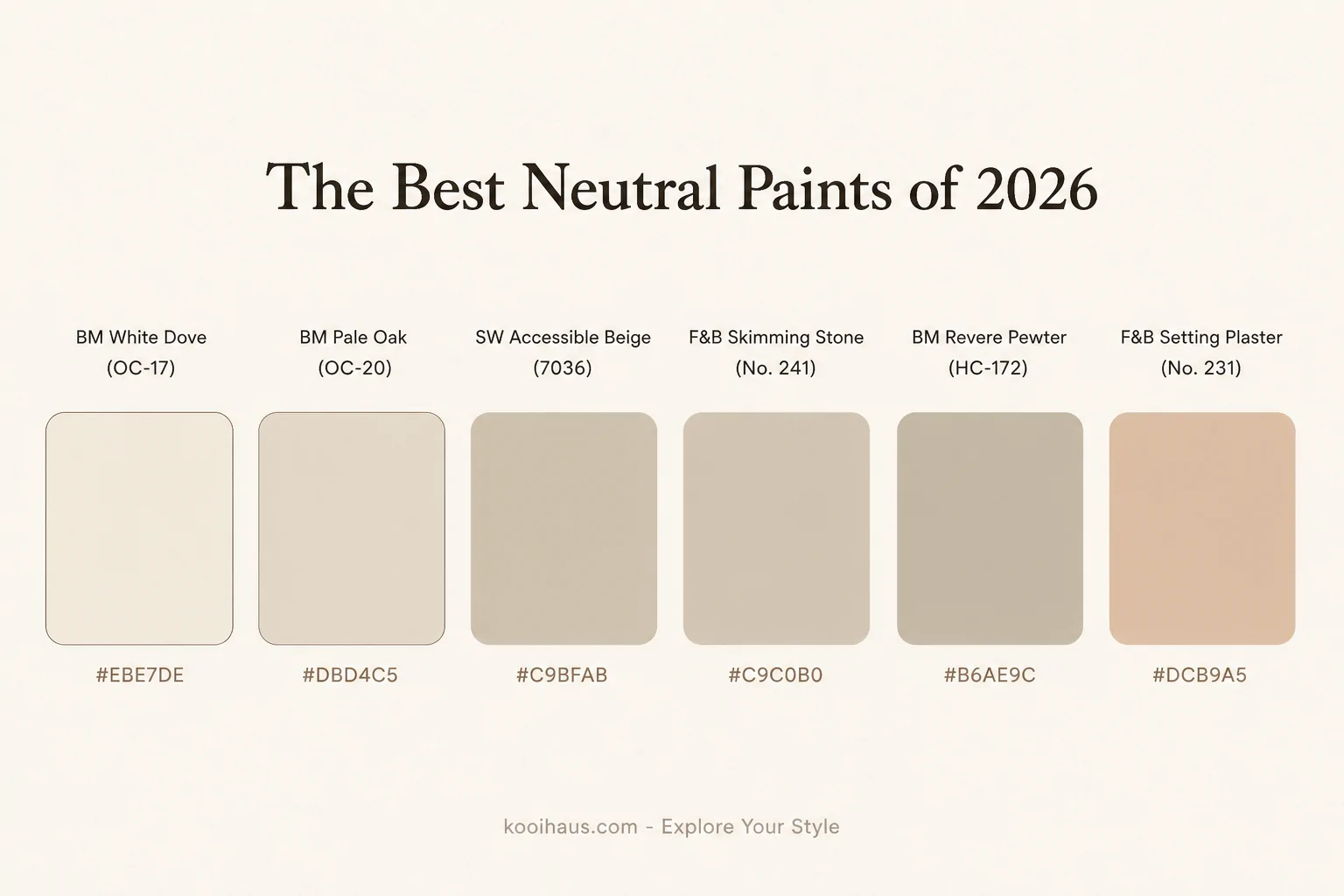
Benjamin Moore White Dove (OC-17). Probably the most-used warm white in modern American interiors. Reads creamy in cool light and clean in warm light. Almost universally flattering.
Farrow & Ball Pointing (No. 2003). A warm cream with subtle yellow undertones. Beautiful in older homes, on millwork, and against wood floors.
Sherwin-Williams Alabaster (SW 7008). A creamy white with slight beige undertones. Was named Sherwin-Williams’ Color of the Year a few years back and has stayed popular since.
Behr Swiss Coffee. The friendly, accessible warm white. Works on walls, trim, and ceilings without too much fuss.
Farrow & Ball Strong White (No. 2001). Slightly cooler than Pointing — a transitional white that works in modern homes with cooler natural light.
Greige and Soft Taupes
Greige is the warm-gray-meets-beige category that has quietly taken over from cool grays. The best greiges read intentional in any light and pair beautifully with both wood and stone.
Benjamin Moore Pale Oak (OC-20). One of the most balanced greiges available. Works in north-facing rooms where pure beige can read yellow.
Sherwin-Williams Accessible Beige (SW 7036). A warmer greige, popular in transitional homes. Pairs especially well with white oak and brass.
Farrow & Ball Skimming Stone (No. 241). A more sophisticated greige with subtle pink undertones. Beautiful in north light.
Benjamin Moore Edgecomb Gray (HC-173). A reliable, warmer greige that reads slightly cooler than Pale Oak.
Sherwin-Williams Agreeable Gray (SW 7029). The internet’s favorite greige for a reason. Genuinely versatile, slightly warm, and forgiving across light conditions.
Soft Stone and Mushroom Tones
For homeowners who want a touch more depth without committing to color, the stone and mushroom categories deliver. These are slightly darker than typical neutrals and create a sense of weight in a room without going dark.
Farrow & Ball Cornforth White (No. 228). A medium gray with cool undertones — works beautifully in modern living rooms with strong natural light.
Benjamin Moore Revere Pewter (HC-172). A warm gray-greige that has been a top seller for over a decade. Reliable, flattering, and pairs with almost any furniture.
Sherwin-Williams Mindful Gray (SW 7016). A warm mushroom gray that gives rooms a sophisticated weight without going moody.
Farrow & Ball Elephant’s Breath (No. 229). A complex mushroom-mauve that reads warm and quietly elegant.
Plaster Pinks and Soft Earth Tones
This category is where the new neutrals get interesting. Plaster pinks and soft earth tones are saturated enough to add warmth, desaturated enough to read as neutrals.
Farrow & Ball Setting Plaster (No. 231). The defining plaster pink — soft, warm, and surprisingly versatile.
Benjamin Moore First Light (2102-70). A barely-there pink that reads almost as a warm white. Was Benjamin Moore’s Color of the Year a few seasons back.
Sherwin-Williams Romance (SW 6323). A muted, dusty rose that reads warm without going sweet.
Farrow & Ball Joa’s White (No. 226). A warm cream with slight peach undertones — beautiful in rooms with lots of warm wood.
How to Choose the Right Neutral for Your Room
The single best advice in paint color selection is also the most ignored: test the color in the actual room before committing. Three rules:
- Buy three samples, not one. The color you initially love often is not the best fit for your room. A backup or two protects you from re-painting.
- Paint large patches. Two-foot-by-two-foot (about 60×60 cm) test patches on at least two walls. Tiny samples are useless — color reads differently at scale.
- Live with the samples for two days. Look at them in morning light, afternoon sun, and evening lamplight. The right color looks right in all three. The wrong color looks fine in one and weird in the others.
How Light Affects Paint
The same paint chip behaves differently in different rooms because light bouncing off floors, fabrics, and adjacent walls amplifies the underlying undertones.
North-facing rooms get cool, even light all day. Warm whites and greiges with yellow or red undertones look best here. Cool whites and gray-toned neutrals can read almost dingy.
South-facing rooms get warm, intense light, especially in afternoon. Cool whites or neutral whites work well; warm cream whites can occasionally read too yellow at peak afternoon.
East-facing rooms get bright morning sun and softer afternoon light. Most neutrals work; the room will read warmer in morning and cooler later.
West-facing rooms get cool morning light and warm afternoon sun. Reverse of east-facing. Greiges and warm whites perform well.
Pairing Paints With Wood and Metal
Paint colors do not exist in isolation. They live next to floors, doors, hardware, and furniture. Three combinations consistently work:
White oak floors + warm white walls + unlacquered brass. The classic 2026 combination. Warm but not yellow, clean but not cold.
Walnut floors + greige walls + matte black hardware. A more modern, slightly cooler look. Adds drama without going dark.
Pale ash or limewashed floors + neutral white walls + aged bronze. Reads quietly Scandinavian. Especially flattering in apartments with limited natural light.
Avoid pairing cool gray walls with warm wood floors — the combination reads disjointed. Pick a temperature lane (warm or cool) and stay in it across the room.
Common Paint Mistakes to Avoid
The first mistake is choosing paint based on the chip in the store. Store lighting is fluorescent and cold; the chip will look different in your home. Always sample.
The second is going too white. A pure bright white in a residential room reads cold even in the best light. Lean cream or warm white instead.
The third is mixing too many warm and cool tones in the same room. Cool gray walls + cool gray sofa + cool gray curtains is a recipe for a room that feels emotionally chilly. Add warm wood, brass, or warm-toned textiles to balance.
Frequently Asked Questions
What is the most popular neutral paint color in 2026?
Benjamin Moore White Dove and Sherwin-Williams Alabaster continue to lead the warm white category. In greiges, Pale Oak and Accessible Beige are the most common picks.
Is Agreeable Gray still relevant?
Yes. Despite some online fatigue, Agreeable Gray remains one of the most reliable greiges for first-time homeowners and reflective rooms.
Can I use the same paint throughout my whole house?
Absolutely. Many designers use a single warm white or greige throughout a home for visual continuity, varying the color through trim, ceilings, or accent walls in adjoining rooms.
What about ceilings? Should they be the same color as walls?
For most homes, a slightly brighter version of the wall color (Benjamin Moore Decorator’s White is a popular ceiling option) creates subtle contrast without breaking the room’s mood. Pure flat white ceilings can read harsh against warm walls.
How often should I repaint?
A high-quality neutral paint job should last 7–10 years with normal wear. Touch up scuffs and high-traffic areas annually for the best long-term look.
The best neutral paint colors of 2026 are forgiving, flattering, and built to last beyond the next trend cycle. Test in your space, lean warm, and pair with wood and brass to avoid the cold-gallery look. A great neutral is the most invisible piece of design in a home — and the most quietly important.
Take the Quiz
Not sure if a neutral palette is really your thing? Take our Interior Style Quiz and find out which interior style and palette fit your home, your light, and the way you actually live.


 Home Accessories
 Furniture