FREE WORLDWIDE TRACKED SHIPPING
How to Choose and Style a Netherlands Poster: From Amsterdam Canals to Utrecht Cathedrals
 By Laura Jones
A Netherlands travel posters can bring Dutch architecture, colour, and atmosphere into a room, turning travel-inspired wall art into a considered interior design choice
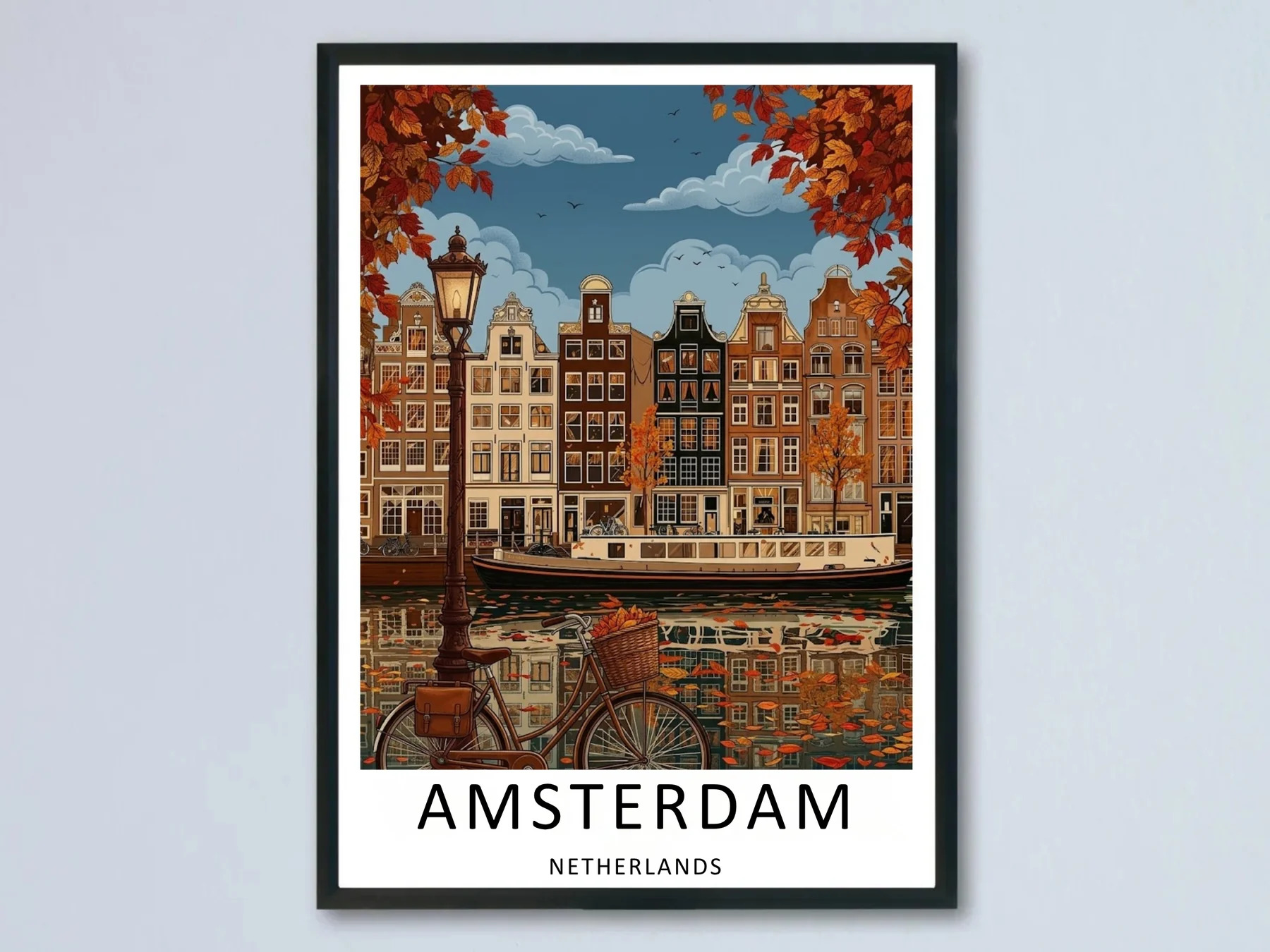
An autumn Amsterdam scene — the kind of Dutch wall art that anchors a living room without needing supporting pieces
A Netherlands poster does something most wall art cannot. It carries weather, light, and architecture into a room without saying a word.
Walk past a print of Amsterdam’s canal houses on a quiet hallway wall and you can almost feel the autumn light bouncing off the water. That is the quiet power of destination-led art — and it is why Dutch cityscapes have become a steady favourite in modern interior schemes.
This piece is a practical look at how to choose, place, and live with a Netherlands poster at home. Not as a souvenir. As a design choice.
An autumn Amsterdam scene — the kind of Dutch wall art that anchors a living room without needing supporting pieces.
Key Takeaways
- Dutch cityscapes work as room anchors because their architecture, colour palettes, and atmosphere translate cleanly into interior design language.
- The strongest Netherlands posters share three traits: clear focal point, controlled palette, and a recognisable silhouette.
- Match the city to the mood — Amsterdam for warmth, Utrecht for autumn calm, Breda for colour-forward rooms, Dordrecht for cool, considered spaces.
- A single well-chosen Netherlands poster usually does more than a cluttered gallery wall of generic prints.
- Frame, mat, and wall colour matter as much as the poster itself.
Why a Netherlands Poster Anchors a Room Differently
Most wall art decorates. A well-made Netherlands poster does something quieter. It anchors.
The reason is structural. Dutch cityscapes are built on repeating geometry — narrow canal houses with stepped gables, water reflections, lamp posts, bicycles, tree-lined streets. When you put that geometry on a wall, the eye reads it as composition rather than ornament.
That distinction matters in interiors. Ornament fights with everything else in a room. Composition agrees with it.
A Holland poster of Amsterdam’s canal belt, for example, contains the same visual rhythm a designer would build into a panelled wall or a row of pendant lights. The print becomes part of the architectural language of the room rather than something hung on top of it.
This is also why Dutch travel posters tend to look more expensive than they are. The underlying subject — historic city planning — already does half the design work.
Matching Each Netherlands Poster to a Dutch City
Not every Dutch city carries the same mood. The choice of city should follow the room’s character, not the other way around. Studios that build curated Netherlands travel posters across multiple destinations — not only Amsterdam — give interior designers far more material to work with.
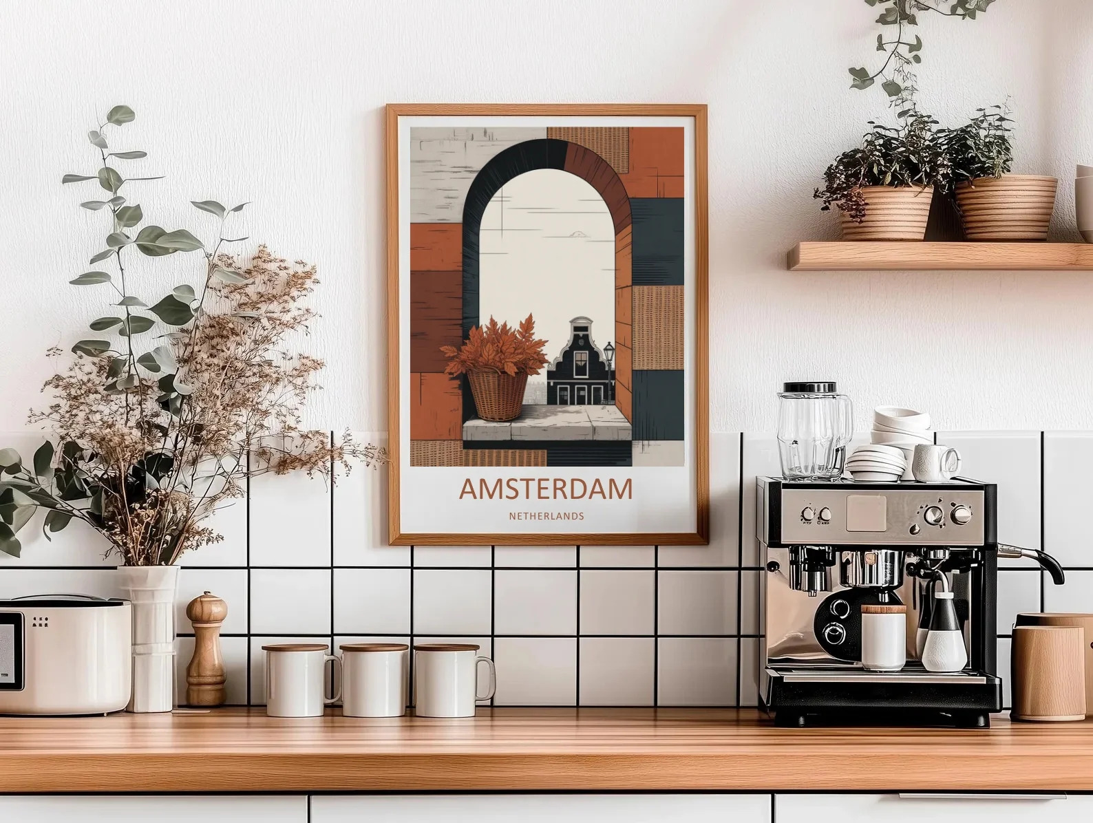
A more stylised Amsterdam print — a single Dutch gable framed inside an arch
Amsterdam delivers density and warmth. Canal houses, gabled roofs, lamplit reflections — the visual story is rich and slightly nostalgic. It suits living rooms and main social spaces because there is enough detail in the image to reward repeated viewing.
A more stylised Amsterdam print — like a single gable framed inside an arch — works in narrower spaces. Hallways, reading nooks, and entryways benefit from posters that read instantly without needing distance to appreciate.
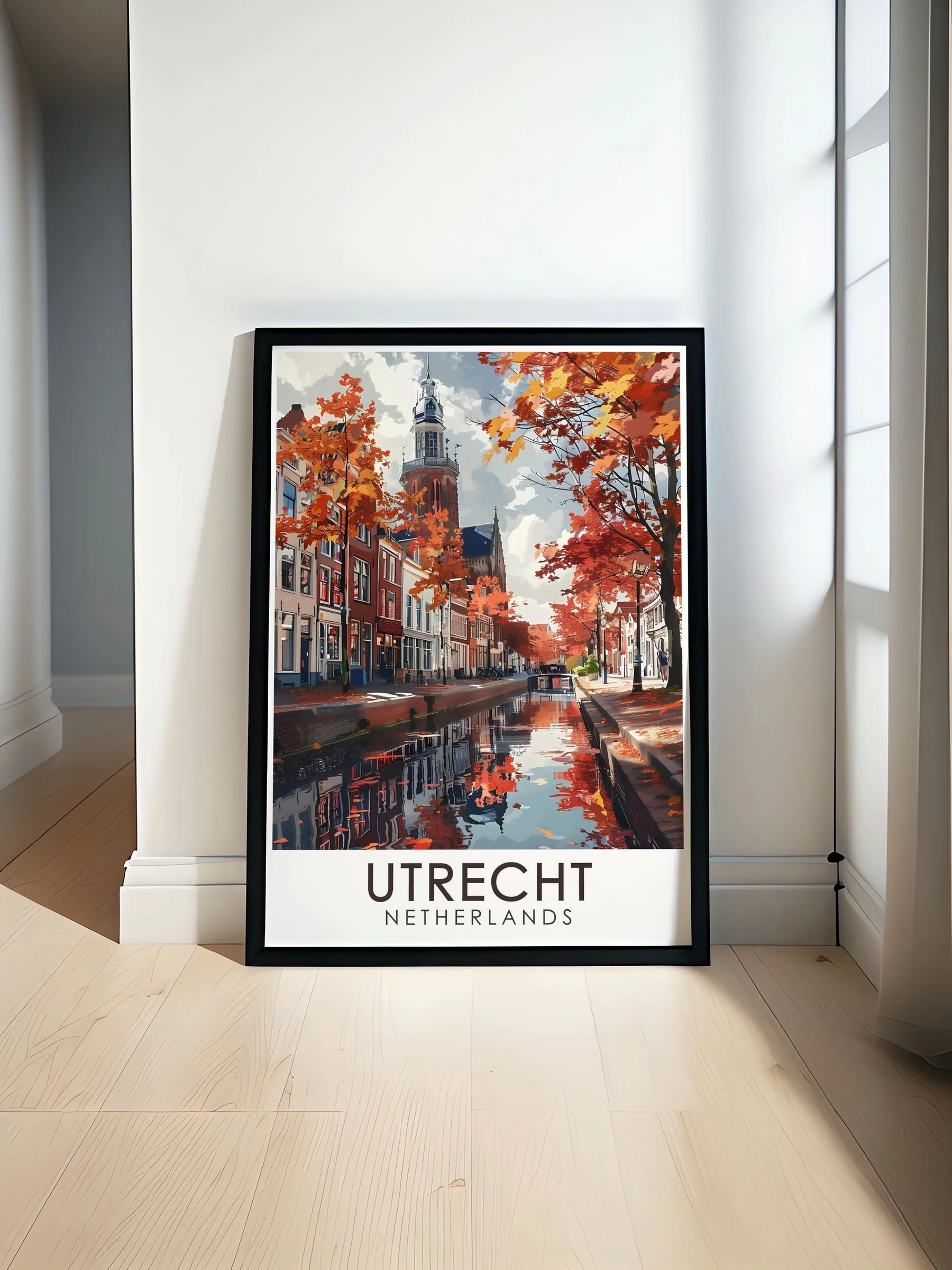
Utrecht’s cathedral tower rising over an autumn canal — quieter, more contemplative
Utrecht offers something different. The cathedral tower rising over an autumn canal reads as quieter and more contemplative. This is the print for a bedroom or a home office, where the room asks for atmosphere rather than energy.
Breda is the colour piece. Saturated reds, blues, and yellows in stepped-roof harmony. Use it in rooms that already have neutral foundations — white or stone walls, oak floors — where a colour-forward poster can do the heavy lifting.
Dordrecht reads cooler. The pale turquoise sky and Gothic cathedral silhouette give it a graphic, almost architectural feel. It works beautifully in studies, libraries, and rooms with a more masculine or minimalist palette.
Matching Dutch cities to room types
| Netherlands poster | Dominant mood | Best room | Wall colour pairing |
| Amsterdam canal scene | Warm, nostalgic | Living room, dining room | Cream, warm white, soft sage |
| Amsterdam arch / editorial | Stylised, calm | Hallway, entryway, reading nook | Charcoal, deep clay, off-white |
| Utrecht cathedral | Quiet, contemplative | Bedroom, home office | Muted greige, warm taupe |
| Breda canal | Vivid, colour-forward | Bright neutral rooms | Pure white, pale stone |
| Dordrecht cathedral | Cool, architectural | Study, library, minimalist spaces | Slate, navy, charcoal |
Best Wall Art for Living Room Decor in Netherlands Themes
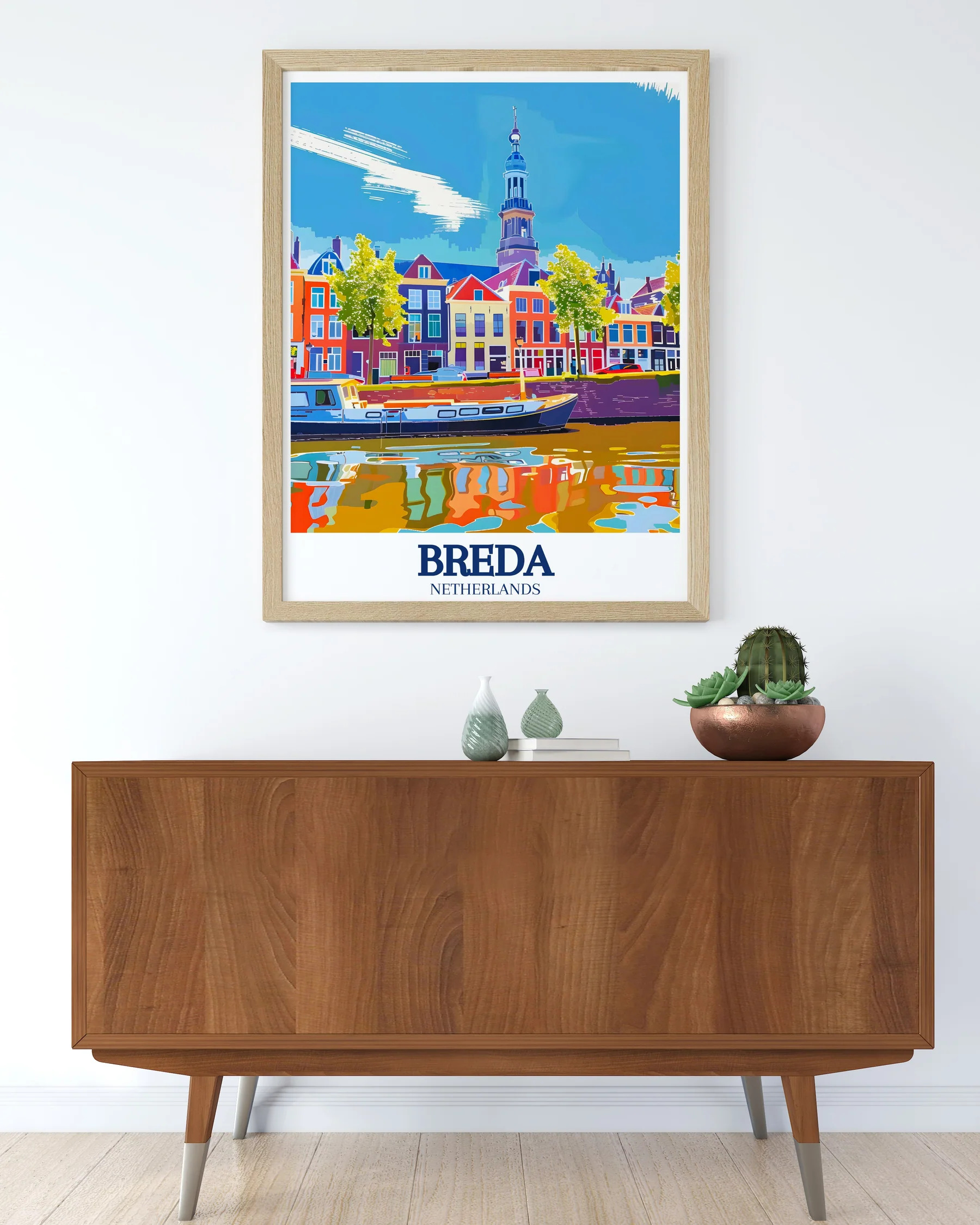
Breda’s saturated palette works hardest in rooms with restrained foundations
The living room is the hardest room to get right because it carries the most decisions. Sofa fabric, rug colour, lighting, and art all compete for attention. A Netherlands poster can simplify all of it — but only if you let it lead.
The strongest approach is to choose one statement Dutch print and design the rest of the room around its dominant colours.
If the print is an autumn Amsterdam scene, pull two or three colours from the leaves and brickwork — rust, cream, deep brown — and echo them in cushions, throws, and a single accent piece. That is it. Nothing else needs to match.
This works because Dutch cityscapes already contain a curated palette. A good Holland poster has gone through the artist’s filter; you are inheriting their colour decisions.
Avoid hanging a Netherlands poster directly above the sofa unless the print is large enough to fill at least two-thirds of the sofa’s width. Smaller prints centred over a sofa look apologetic. Either commit to scale or move the poster to a different wall.
Living room sizing for Dutch wall art
| Sofa width | Recommended poster size | Hanging height above sofa back |
| Under 180 cm | 50×70 cm (single print or pair) | 15–20 cm |
| 180–220 cm | 70×100 cm | 18–22 cm |
| Over 220 cm | 100×140 cm or two-piece arrangement | 20–25 cm |
Color Palettes That Carry Dutch Atmosphere Into Modern Interiors
Dutch wall art reads cleanly because most Netherlands posters draw from a limited natural palette. Understanding that palette helps you build a room around the print rather than against it.
Three palettes dominate Dutch travel imagery.
Earthy autumn — rust, ochre, deep brown, cream. This is Amsterdam in October, Utrecht under maple trees. Works with warm neutrals, brushed brass, oak.
Saturated pop — primary reds, blues, and yellows. This is Breda, summer light, festival energy. Works with bright white walls, simple modern furniture, no competing pattern.
Cool architectural — slate, turquoise, stone, deep grey. This is Dordrecht’s cathedral against pale sky. Works with darker walls, brushed steel, leather, and considered restraint.
The mistake is mixing palettes in one room. A Breda colour-pop poster fights with a Utrecht autumn print on the same wall. Choose one Dutch mood and let it lead the space.
Dutch palette to room palette
| Poster palette | Wall colour | Accent metals | Avoid |
| Earthy autumn | Cream, warm white, soft sage | Brass, copper | Cool grey, chrome |
| Saturated pop | Pure white, pale stone | Brushed nickel, matte black | Heavy patterned walls |
| Cool architectural | Slate, deep navy, charcoal | Brushed steel, blackened brass | Warm beige, terracotta |
How to Arrange a Netherlands Gallery Wall
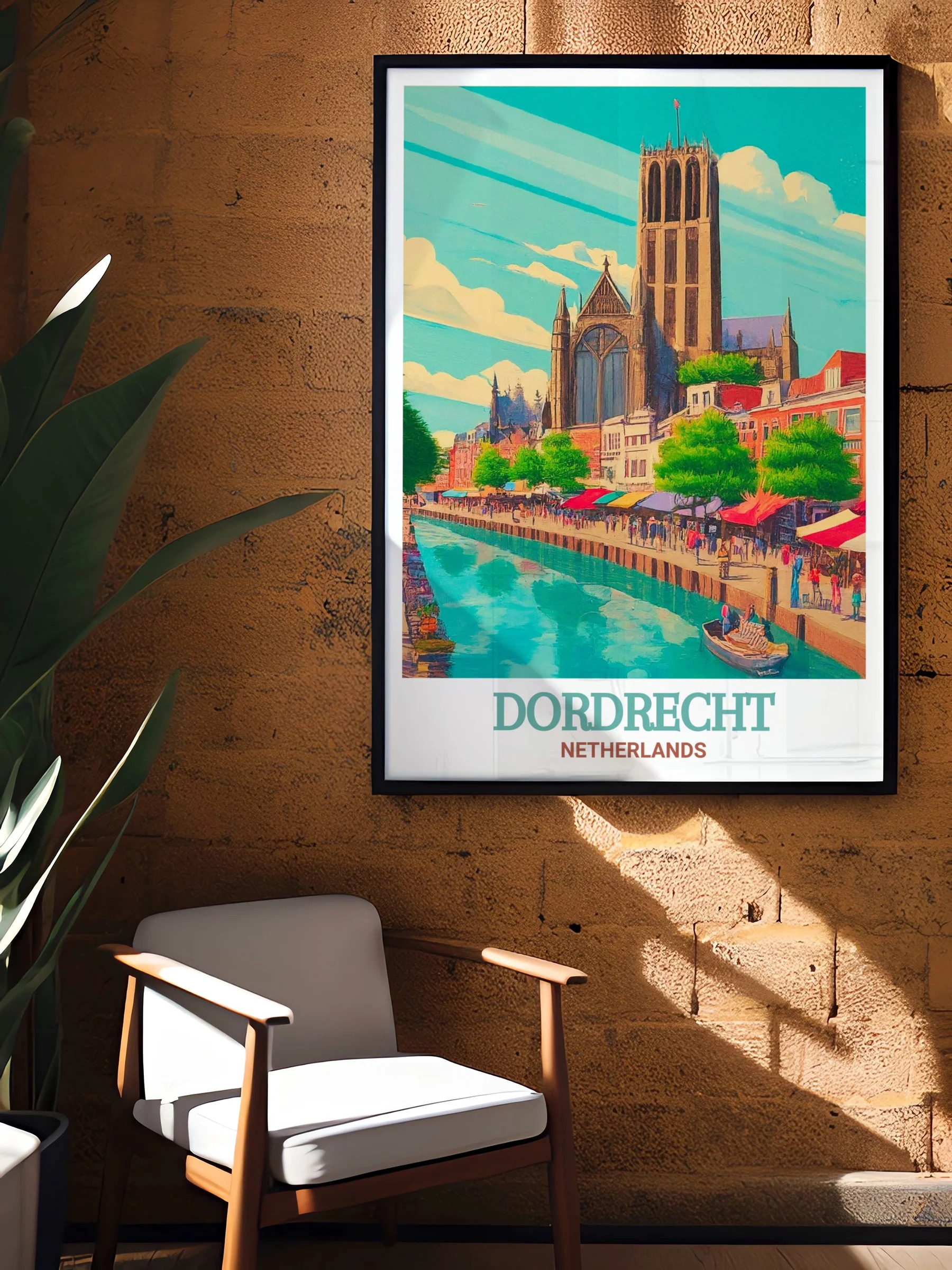
Dordrecht’s cooler palette works well in studies and considered spaces
Single Dutch prints almost always outperform gallery walls of mixed Netherlands posters. The exception is a tightly curated set that treats the Netherlands as a series rather than a collage.
Three arrangements that consistently work:
The pair — two cities of similar mood, hung side by side with even spacing. Amsterdam and Utrecht autumn prints together, or two Dordrecht studies. Same size, same frame, same mat width.
The triptych — three prints of a single city, varied in subject (canal, gable, market square), hung in a clean horizontal row. This reads as a curated sequence rather than a wall of posters.
The vertical stack — two prints of the same destination, stacked top to bottom with 4–6 cm of frame-to-frame spacing. Best for narrow walls and hallways. Choose vertical-format Dutch posters for this one.
Avoid mixing frames. Black frames with black frames, natural oak with natural oak. The Dutch architecture in the prints already provides visual variety; the frames should disappear.
Avoid mat colours other than off-white or warm white unless the room calls for something specific. Coloured mats compete with the print.
Common Mistakes With Dutch Wall Art
A few patterns come up repeatedly.
Hanging too high. Posters belong at average human eye level — roughly 145–150 cm from floor to print centre. Most people hang 10–15 cm too high.
Choosing the print to match the sofa. A Netherlands poster should set the palette, not chase it. Furniture is replaceable; the architectural language of a Dutch city is not.
Buying small. A single small Holland poster on a large wall looks like an afterthought. Either scale up or group thoughtfully.
Skipping the mat. An un-matted poster reads as a poster. A matted print reads as art. The 2–3 cm of breathing space costs little and changes the whole impression.
Defaulting to Amsterdam. Amsterdam is not always the answer. The lesser-known Dutch cities — Dordrecht, Utrecht, Breda — often photograph and paint better because they are less visually crowded.
Frequently Asked Questions
What is the best Netherlands poster for a living room?
An Amsterdam autumn canal scene or a Utrecht cathedral print is usually the strongest choice because both contain warm tones and balanced composition. Choose the city whose palette matches your existing furniture and wall colour. Sizing should sit between 70×100 cm and 100×140 cm for most sofa-anchored living rooms.
What size should a Holland poster be?
For a feature wall, 70×100 cm or larger. For a hallway or stairwell, 50×70 cm is usually enough. For a gallery arrangement, match all prints to the same size for a clean read.
Are Dutch wall art prints suitable for modern minimalist interiors?
Yes — particularly the more graphic Netherlands posters like editorial Amsterdam compositions or Dordrecht cathedral prints. Their controlled palettes and strong silhouettes complement minimalism rather than competing with it.
How do I keep a gallery wall of Dutch prints from looking cluttered?
Limit yourself to one city or one mood, use identical frames and mat widths, and keep spacing consistent. Three to five prints is the sweet spot.
Which Dutch city poster works best in a small apartment?
The stylised Amsterdam arch composition or a single Utrecht print. Both have strong, simple silhouettes that read well at smaller sizes and do not overwhelm a compact room. Avoid dense canal scenes in small spaces — the eye needs distance to take them in.
A Netherlands poster works in a home the way good Dutch architecture worked in the seventeenth century — through proportion, restraint, and quiet repetition. Choose the city that fits the room, scale the print to the wall, and let the geometry do the rest.










 Blankets and Throws
 Home Accessories
 Furniture
 Rugs
Rugs Cushions
 Kitchen
 Cutlery and Dinnerware
 Drinkware
 Table Mats and Coasters
 Dining Accessories
 Tablecloths and Napkins
 Decorative Items
 Vases and Planters
 Wall Decor
 Bathroom Accessories
 Bathroom Storage
 Bath and Shower Mats
 Towels