FREE WORLDWIDE TRACKED SHIPPING
IKEA KONSTRUNDA Turns Objects Into Art — These 5 Ideas Earn the Space
 By Alex Carter
IKEA's KONSTRUNDA collection brings 22 artist-led objects into the home. These five design ideas are the ones worth making space for.
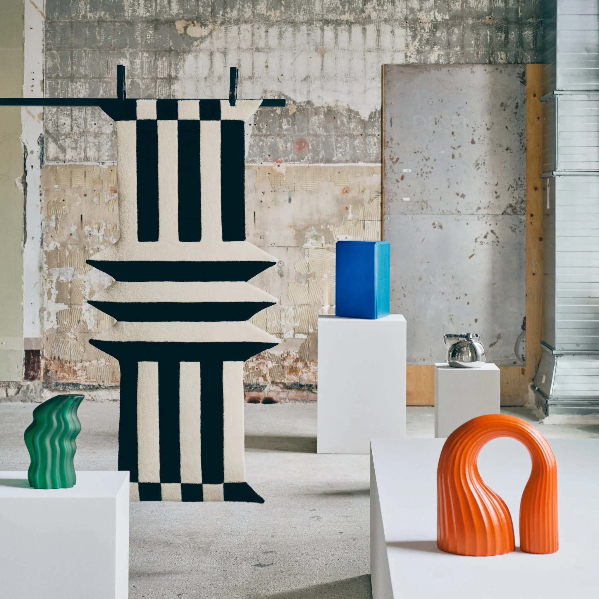
© Inter IKEA Systems B.V. 2026. Source: IKEA Newsroom.
The first thing in IKEA’s new KONSTRUNDA collection that looks useful is a table. It has a glass top held inside a welded chrome frame, and it can carry a drink. The second thing worth noticing is that usefulness is not the collection’s argument.
KONSTRUNDA is a limited-edition group of 22 art objects by seven creators, due in IKEA stores and online on September 1, 2026. It includes glass, ceramics, textiles, stools, tables, bowls, a mirror, and objects that IKEA does not try to excuse with a second function. That departure matters. IKEA has spent decades teaching shoppers to ask what a thing does. Here, it asks what a thing changes.
I reviewed IKEA’s August 13 launch release and all 22 official newsroom images. I did not handle the pieces, and IKEA had not published a complete U.S. price list when this article was prepared. This is a reading of the collection’s forms, materials, and likely behavior in a room, not a durability test or buying review.
The strongest idea is visible across the range: the best pieces do not merely add color. They change as you move around them. A dent catches light, an arch frames empty wall, a mirrored cube returns the viewer to the object, and a rough textile breaks the flatness of a room. That is the difference between an object that photographs well once and one that keeps working after the photograph.
What the IKEA KONSTRUNDA collection actually is
IKEA describes KONSTRUNDA as an “Art Tour,” which is the English meaning of the Swedish name. The company gave the contributors a broad brief and let each develop an independent body of work. The result is deliberately uneven. A black-and-white rug does not try to match a mouth-blown green glass form. A pine stool sits beside an orange ceramic arch without pretending they came from the same set.
That lack of coordination is the point. Most mass-market decor collections are designed to remove risk: the cushion matches the rug, the vase repeats the lamp, and the room arrives pre-approved. KONSTRUNDA leaves the edit to the buyer. It offers a field of distinct voices rather than one prescribed look.
This makes the collection closer to a gallery visit than a seasonal room drop, but the comparison has limits. IKEA is still manufacturing repeatable products at retail scale. The objects may be artist-led, but they are not unique works, and the launch has not yet established how prices, stock, or market availability will vary. The useful claim is narrower: art-led objects are being placed in the same shopping path as stools and cushion covers.
For a home, that changes the question from “Does this match?” to “Does this hold the room?”
1. Choose an object that changes with the viewpoint
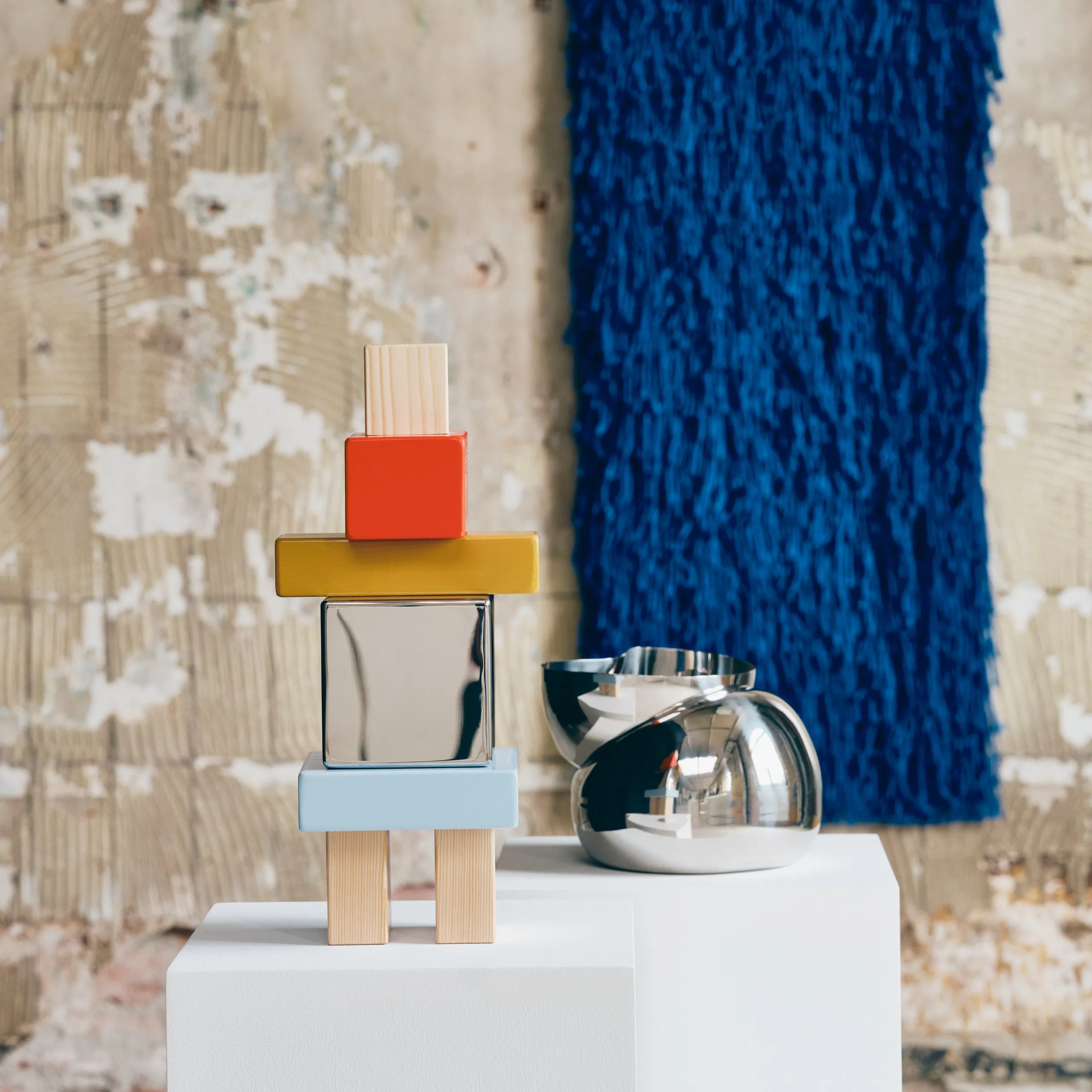
Akanksha Deo’s group makes the clearest case. A polished stainless-steel bowl appears to have been pressed inward from one side. A stacked geometric figure contains a mirrored cube. A bright blue wall textile has long fibers that turn a flat rectangle into something closer to a character.
The mirror is not decoration applied after the form. It completes the form by putting the viewer inside it. Walk past, and the center changes. The punched bowl behaves similarly: the depression alters the reflection, so the surface never reads as one fixed curve.
That is the first idea worth stealing from KONSTRUNDA. If an object is going to occupy valuable visual space, it should offer more than a front view. A reflective, perforated, folded, or deeply textured piece can change with daylight and movement without requiring another color, print, or accessory beside it.
Worth it if: the room is visually quiet and the object will be seen from several directions.
Skip it if: the only available position is a crowded shelf. A form built around reflection and silhouette needs air around it. Packed between books and frames, it becomes expensive clutter.
2. Let one useful object carry the sculptural load
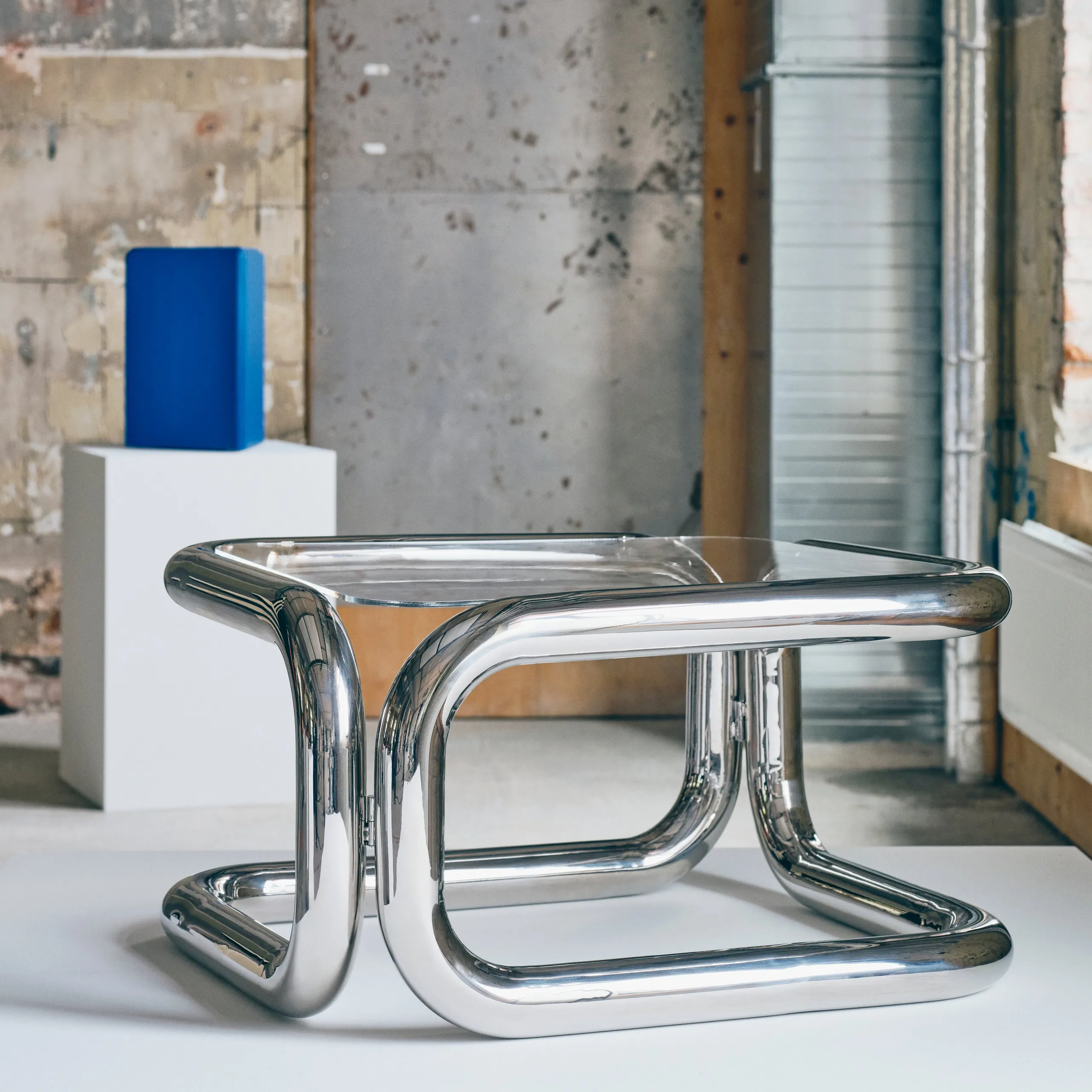
Andu Masebo’s chrome-and-glass table is the collection’s largest visual commitment. The frame is made from thick welded tubes that bend around the glass top like an oversized drawing. It is recognizably a table, but the structure refuses to disappear beneath what it supports.
This is where KONSTRUNDA connects with the more functional experiments in IKEA PS 2026, while taking the opposite route. IKEA PS makes function playful. Masebo makes function almost incidental to the object. The table still earns its floor area, but it does not apologize for being present.
The trade-off is scale. Transparent glass can reduce visual mass, but the chrome outline is intentionally loud. In a small room, it should replace the existing coffee or side table, not join it. The correct measure is not whether the piece physically fits. It is whether there is enough empty floor and wall around the frame for the drawing to remain legible.
Worth it if: one table can do the practical job while also becoming the room’s only strong object.
Skip it if: the room already has statement lighting, a patterned rug, and open shelving. The table needs visual authority, and authority cannot be split five ways.
3. Use material behavior instead of color matching
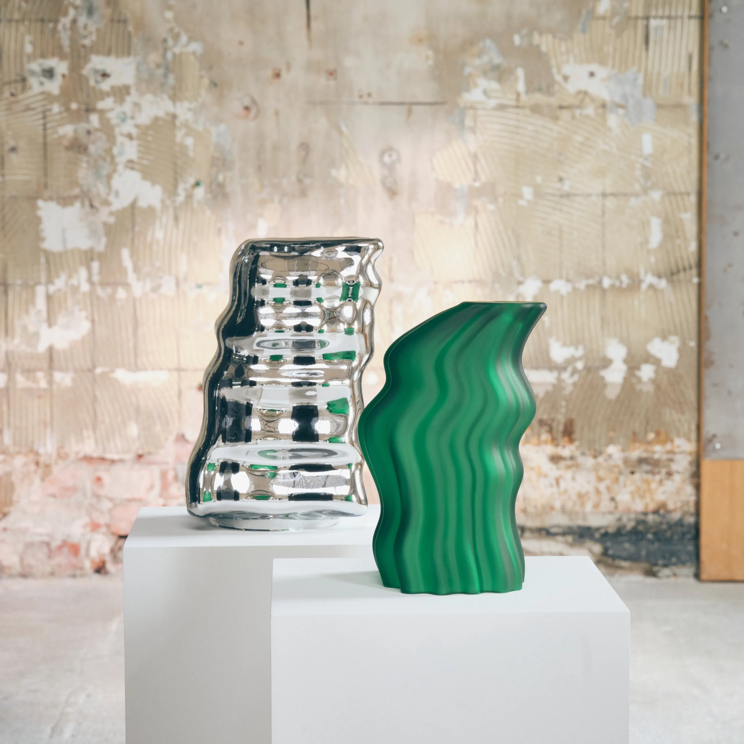
Lisa Reiser’s mouth-blown glass pieces work through light, thickness, and irregular outline. One green form has the swollen, translucent look of a gummy sweet. A silver companion throws the room back in distorted fragments. A black vessel uses gloss and shadow to make its edges difficult to read.
None needs a matching cushion. Their effect comes from material behavior: glass transmits light, polished metal reflects it, and black lacquer compresses it into highlights. This is a more durable way to bring energy into a room than repeating one fashionable color across several purchases.
It is also easier to control. A small glass object can sit where the light changes during the day: near a window, on a deep sill, or at the end of a console. The object does not need to dominate the whole room to register. Its surface does the work.
There is a practical caution. Mouth-blown glass can carry small variations, but the official launch material does not yet provide enough care, weight, or edge-detail information to judge how these pieces behave in a busy household. A low table in a room with children or an energetic dog is not a neutral setting. Art becomes part of circulation the moment it enters a home.
Worth it if: you want one compact object whose appearance changes with real light.
Skip it if: the only safe location is above eye level. These forms depend on seeing their curves and reflections, not just their color.
4. Use negative space before adding another pattern
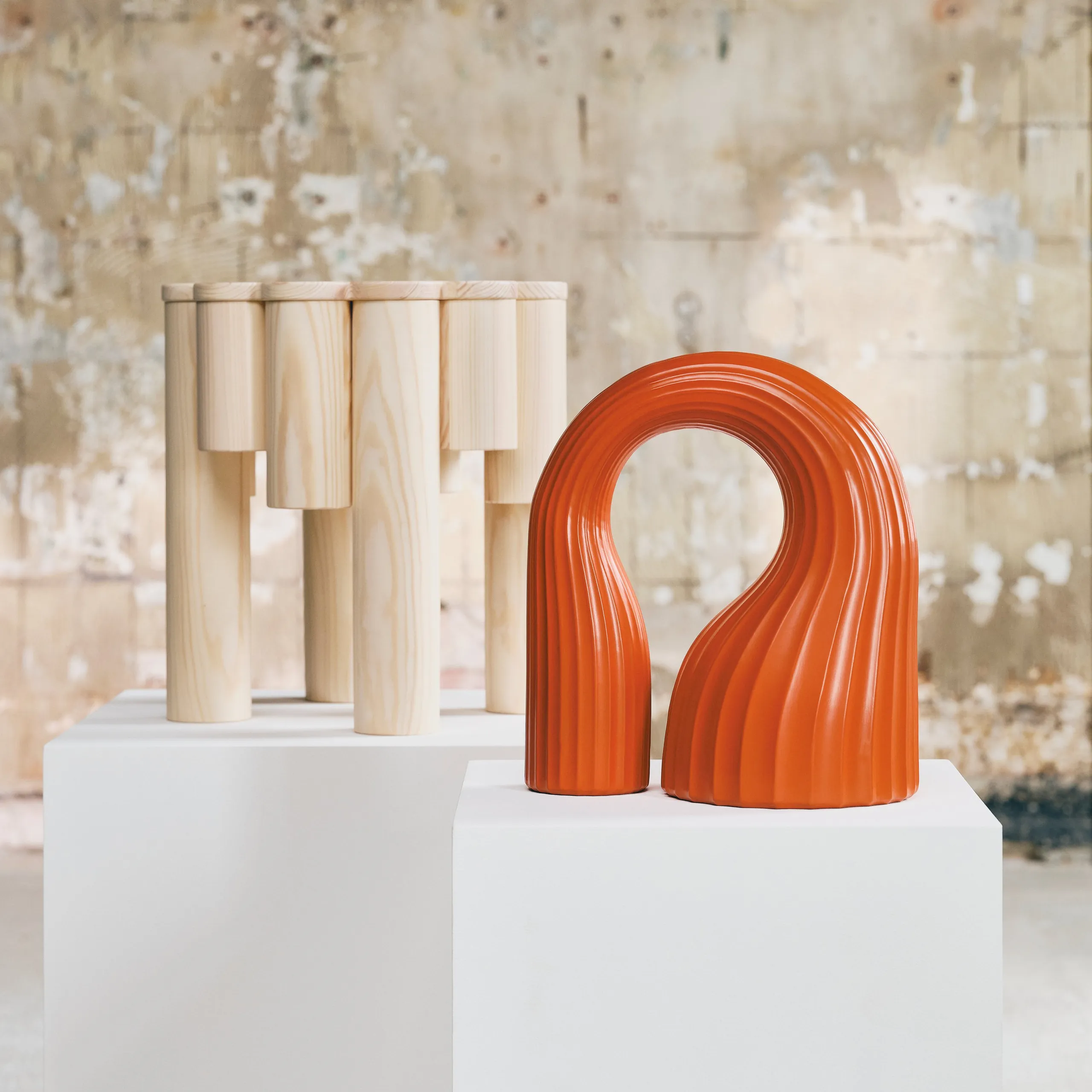
Lisa Hilland’s orange ceramic object is an arch with an unusually thick outline. The empty center is nearly as important as the ceramic around it. Placed against a wall, the object frames a patch of the room and turns that absence into part of the composition.
This is the quietest design lesson in a collection full of bright objects. When a room feels flat, the reflex is often to add a print. Negative space offers another route. An open form, a loop, an arch, or a perforated object creates depth without covering another surface.
Hilland’s pine stool works by a related method. Its top is assembled as a radiating pattern of wood pieces, so construction becomes ornament. Pine is closely associated with IKEA’s everyday furniture, but here the familiar material is asked to hold attention. That makes it a useful bridge between art object and ordinary room.
The orange arch and pine stool should not automatically be bought together. They are shown together because the contrast clarifies both pieces, not because every home needs the pair. The collection’s own gallery staging is an editing lesson: each object gets a plinth, distance, and a clean background. At home, the equivalent is simply restraint.
Worth it if: the object can frame a calm wall, doorway, or patch of daylight.
Skip it if: you plan to fill the opening with smaller objects. The empty part is not unfinished space. It is the design.
5. Treat textiles as art, not as soft filler
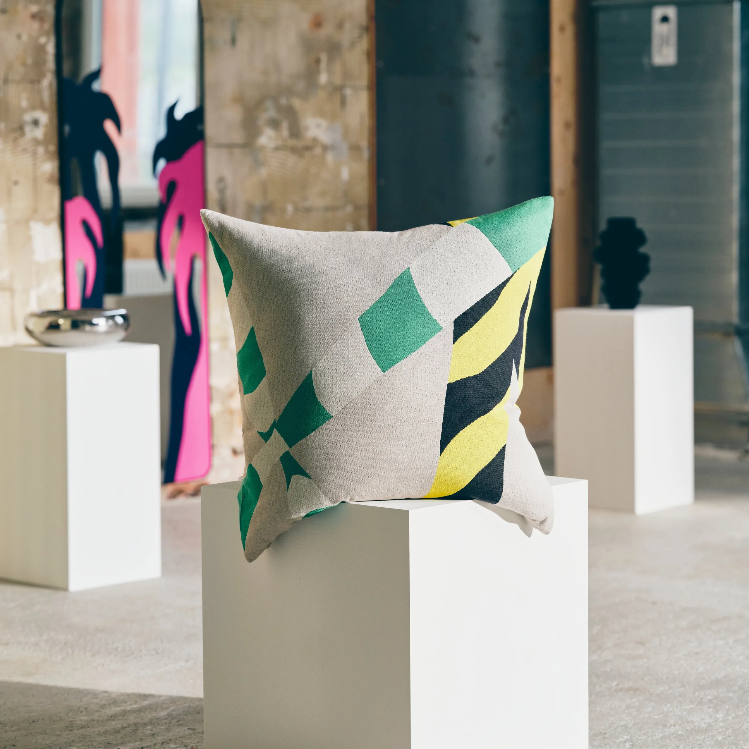
Ingrid Leander and Igor Holtermann drew from caution banners, zebra crossings, and other city patterns that people learn to stop seeing. Their graphics appear on cushions, oversized floor pillows, rugs, and a decorated full-length mirror. The move is simple: take visual information from outside the home and change its scale until it becomes strange again.
Textiles are the lower-risk entry point to this collection because they do not require a permanent pedestal or a large furniture swap. They also come with a familiar danger. A patterned cushion is easy to buy and easy to demote into filler.
To prevent that, give it the treatment usually reserved for art. Let one oversized floor cushion sit against a plain surface rather than burying it among five smaller pillows. Hang a textile where its edge and texture can be read. Place the illustrated mirror where it reflects a calm part of the room, not an open wardrobe or a television.
This is where the collection can extend the thinking in our gallery wall guide. Art does not have to mean framed paper, and a wall does not improve merely because more frames fit on it. A textile can bring scale, sound absorption, and physical texture while still carrying a graphic idea.
Worth it if: you want a large visual move without adding another piece of hard furniture.
Skip it if: the textile will be treated as a temporary color accent. These patterns are too specific to work as anonymous background.
A practical placement test before September 1
KONSTRUNDA will be available globally in IKEA stores and online beginning September 1, according to the official launch release. Availability can still vary by market, and IKEA had not published every local listing when this article was prepared. That makes the next two weeks useful planning time, not a reason to buy blind.
Use this four-part test:
| Question | What to look for | Stop if |
|---|---|---|
| Where will it breathe? | One clear wall, surface, or floor zone | It must share a crowded shelf |
| What changes as you move? | Reflection, shadow, texture, or open form | It has only one good camera angle |
| What does it replace? | A table, cushion group, mirror, or existing decor object | It only adds another layer |
| What is the household cost? | Cleaning, breakage risk, circulation, and storage | The room has to work around it |
Then photograph the intended spot from the doorway and from the seat used most often. If the object would only work in a close crop, it probably does not work in the room. The best KONSTRUNDA pieces are designed to be read in the round. Give them a real room, not a product shot.
The same restraint appears in the better parts of Bauhaus and IKEA: form becomes legible when unnecessary competition is removed. KONSTRUNDA is more expressive, but it still depends on clarity.
The verdict: choose one voice, not the whole tour
KONSTRUNDA is strongest when IKEA stops asking art to justify itself with storage, seating, or another practical trick. That does not make function irrelevant. It makes placement the buyer’s responsibility.
The chrome table earns the space by doing two jobs without looking compromised. The glass objects earn it through changing light. The orange arch makes the wall behind it part of the piece. The guardian figure returns the viewer’s face. The textiles offer scale without another hard object.
The collection is called an Art Tour, and that is the correct way to shop it. Walk through. Notice which voice holds your attention. Then leave most of the tour where it is.
One object with enough space around it will change a room. A matching haul will only prove that IKEA had a launch day.








 Blankets and Throws
 Home Accessories
 Furniture
 Rugs
Rugs Cushions
 Kitchen
 Cutlery and Dinnerware
 Drinkware
 Table Mats and Coasters
 Dining Accessories
 Tablecloths and Napkins
 Decorative Items
 Vases and Planters
 Wall Decor
 Bathroom Accessories
 Bathroom Storage
 Bath and Shower Mats
 Towels