Japandi Color Palette: 12 Perfect Combinations
A Japandi color palette is built from quiet, organic neutrals — here are twelve combinations that nail the look every time.
A Japandi color palette in action: warm whites, greige, oak and a touch of soft black.
A great Japandi color palette is built from quiet. Where Scandinavian rooms can lean cool and Japanese rooms can lean stark, Japandi sits in the middle: warm, grounded, and almost entirely drawn from the natural world. Get the palette right and the rest of the style — the linen, the oak, the paper lanterns — falls into place on its own.
What Defines a Japandi Color Palette
The Japandi color palette is a study in restraint. It pulls from earth, stone, plaster, and tea. There are no electric blues, no candy pinks, no high-saturation accent walls. Instead, the look is built on layered neutrals — warm whites, oat, greige, mushroom, river stone, and the soft black of sumi ink — punctuated occasionally by a muted natural color like sage, terracotta, or rust.
The trick is that almost every color in the palette is desaturated. A Japandi green is not emerald; it is the green of an olive leaf. A Japandi blue is not navy; it is the gray-blue of a winter sky. The result is a room where nothing competes, and where the texture of materials does most of the talking.
The Six Anchor Colors
Before you start mixing, it helps to know the six anchors that show up in nearly every Japandi room. Most palettes are built from three or four of these.
- Warm white — creamy, never blue-white. Think the color of unbleached muslin or fresh oat milk.
- Oat / greige — the soft middle ground between beige and gray, usually a few shades darker than the wall.
- Stone — a cool, dusty gray-beige reminiscent of river rock.
- Mushroom / taupe — a deeper, warmer neutral that grounds upholstery and rugs.
- Soft black — almost never pure black. More like sumi ink or charred oak; used in small doses.
- Pale wood — not technically a paint color, but the warm tan of oak or ash is a load-bearing tone in every Japandi room.
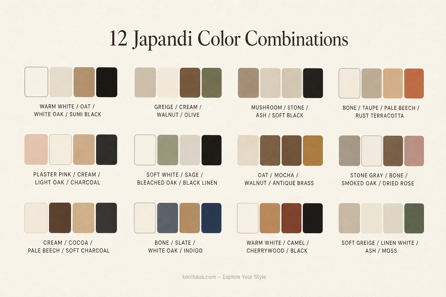
12 Perfect Japandi Color Combinations
Below are twelve combinations we keep returning to. Each is built around one wall color, one upholstery tone, one wood tone, and one accent — the four-color rule that keeps Japandi rooms from drifting into clutter.
1. Warm White + Oat Linen + White Oak + Sumi Black. The starter palette. Works in any room, in any climate, at any budget.
2. Greige + Cream + Walnut + Olive. Slightly warmer and a touch more sophisticated. The olive accent comes through best in a single throw or a stem of dried foliage.
3. Mushroom + Stone + Ash + Soft Black. Cooler, more sculptural. Looks especially good in north-facing rooms where light stays even all day.
4. Bone + Taupe + Pale Beech + Rust Terracotta. The most Mediterranean of the Japandi palettes — perfect for warm climates and plaster walls.
5. Plaster Pink + Cream + Light Oak + Charcoal. Plaster pink is so muted it reads as a warm neutral. The charcoal accent keeps the room from feeling sweet.
6. Soft White + Sage + Bleached Oak + Black Linen. The garden palette. Sage is the safest “color” choice in a Japandi room; it acts almost like a neutral against pale wood.
7. Oat + Mocha + Walnut + Antique Brass. Warmer, richer, more autumn. Brass sneaks in where Japandi rooms usually have black.
8. Stone Gray + Bone + Smoked Oak + Dried Rose. A refined urban palette. The dried rose is best as a single soft furnishing, not a wall.
9. Cream + Cocoa + Pale Beech + Soft Charcoal. Reads cozier than most Japandi palettes — built for living rooms you actually live in.
10. Bone + Slate + White Oak + Indigo. A subtle nod to traditional Japanese textiles. The indigo should appear once: a cushion, a piece of art, never the walls.
11. Warm White + Camel + Cherrywood + Black. The richest of the warm Japandi palettes. Cherrywood is uncommon but stunning when treated with restraint.
12. Soft Greige + Linen White + Ash + Moss. The quietest palette in the list — and probably the easiest to live with for years.
How to Mix Whites in a Japandi Room
One of the harder Japandi moves is mixing more than one white in a single room. Done well, it adds texture without color; done poorly, it looks like the painter ran out. The rule of thumb is to keep all whites on the warm side, and to give them at least 10 percent contrast in lightness so the eye reads them as intentional.
A good combination is a creamy off-white on the walls (Benjamin Moore White Dove or Farrow & Ball Pointing are classic), a slightly deeper warm white on millwork or built-ins, and a near-bone white on linen upholstery. The walls, trim, and fabric should feel like three frequencies of the same note.
Adding Color Without Breaking the Palette
Japandi tolerates color, as long as the color is borrowed from nature and used sparingly. Three rules cover most situations:
- Use color in soft furnishings first — a throw, a cushion, a vase — before committing to a wall.
- Pick colors at half their normal saturation. Sage rather than emerald. Rust rather than red. Indigo rather than royal.
- Limit yourself to one accent color per room. Two competing accents read busy almost immediately.
Where Bold Color Belongs (and Where It Does Not)
If you love color and Japandi feels too quiet, the bedroom is the safest place to push the palette. A muted teal or burnt sienna on the wall behind the bed, paired with cream linen and oak nightstands, can carry a strong color without breaking the style. Living rooms tolerate less; kitchens, even less. The dining room is somewhere in between — a deep moss or charcoal accent wall behind a dining table can look stunning, especially with paper pendants overhead.
Testing Paint in Real Light
Paint behaves differently in every room. A warm white that looks creamy in a north-facing kitchen can look almost yellow in a south-facing living room. Always paint at least three test patches — one on each major wall — and live with them for a full day before committing. Pay attention to morning, afternoon, and evening light. If a color looks great at noon and dingy at 7 p.m., it is the wrong color.
Frequently Asked Questions
Is gray part of the Japandi color palette?
Cool gray is rarely the right choice for Japandi. Warm gray-beige (greige) and stone are much closer to the spirit of the style. A pure cool gray can drift toward a corporate feel.
Can you do a dark Japandi room?
Yes — but the darkness should come from soft black or deep mushroom, not navy or charcoal-blue. Pair dark walls with plenty of warm wood and at least one ceramic or paper light to soften the room.
What about black?
Soft black is a key Japandi accent. Use it for slim metal floor lamps, picture frames, spindle chairs, and small ceramic objects. Avoid full black walls unless you also have huge windows and warm wood floors.
How many colors should a Japandi room have?
Three to four, including the wood tone. More than that almost always feels busy. The four-color rule (wall, upholstery, wood, accent) is a solid starting point.
Does Japandi work with white walls?
Yes — but warm white, not cold white. Cold whites read clinical against natural wood, while warm whites flatter linen, ceramic, and pale oak.
Once you have your palette settled, the rest of Japandi gets easier. The walls, the wood, the upholstery, and the single accent should all feel like they were borrowed from the same quiet room. Start with one combination from this list, layer texture instead of more color, and let the palette do the heavy lifting.
Take the Quiz
Not sure if a Japandi color palette is really your thing? Take our Interior Style Quiz and find out which palette and style fit the way you actually live.
KŌŌI / KŌŌI Magazine / Living Room Decor Ideas / Japandi Decor Ideas /


 Home Accessories
 Furniture