FREE WORLDWIDE TRACKED SHIPPING
How to Choose Wall Art That Works with Your Furniture and Interior Style
 By Laura Jones
İlyas Tingir of Hencely explains how to match wall art with furniture scale, color, material, placement, and the proportions of a room
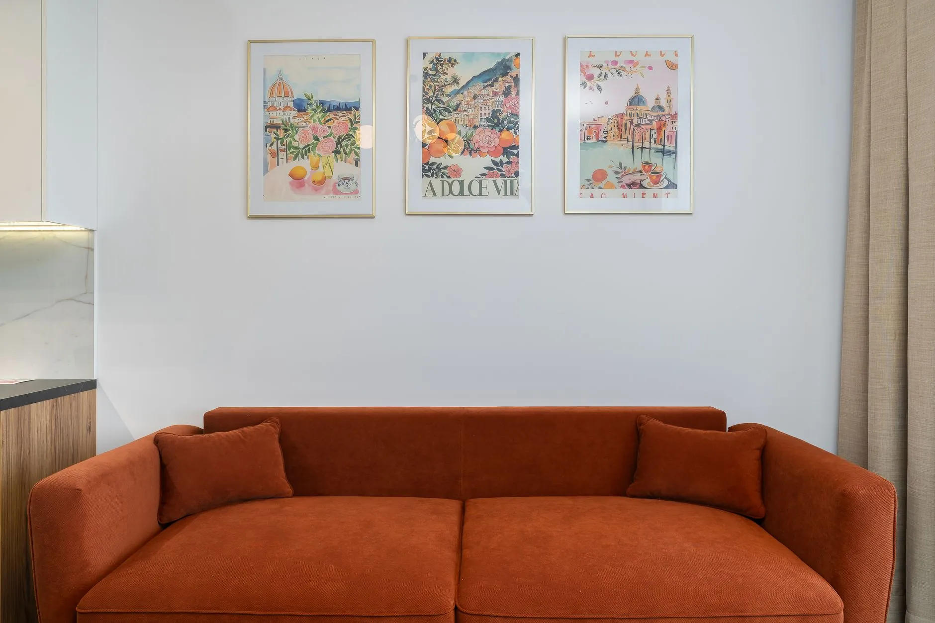
Wall art should relate to the furniture below it in scale, color, and visual weight. Photo by Mateusz Pielech on Pexels.
Wall art can completely change how a room feels, but choosing the right piece involves more than simply finding something attractive. Art has to live alongside furniture, lighting, architectural details, textiles, and the proportions of the room itself. A piece that looks perfectly balanced in one space can feel undersized, oversized, or disconnected in another.
The most successful interiors tend to treat wall art as part of the overall composition rather than as a finishing touch added after everything else. By considering scale, proportion, color, placement, and the style of your existing furniture, you can choose artwork that makes the entire room feel more intentional.
Start With the Furniture, Not the Empty Wall
An empty wall can make almost any piece of art look too small when viewed on its own. Instead of judging artwork against the dimensions of the entire wall, consider the furniture that will sit beneath or beside it.
A sofa, console table, bed, sideboard, or dining table creates a visual zone. The artwork should generally relate to that zone rather than floating independently in the surrounding wall space.
For example, a small framed print centered above a long sofa may technically be positioned correctly, but it can still feel visually disconnected because its scale does not relate to the furniture below it. A larger piece or a carefully arranged group of smaller works will usually establish a stronger relationship.
Before shopping, measure both the available wall space and the furniture. Even simple measurements can prevent one of the most common decorating mistakes: choosing artwork based on appearance alone and discovering later that its proportions do not work in the room.
Pay Attention to Scale and Proportion
Scale is one of the strongest tools for creating visual balance.
Large furniture generally needs artwork with enough visual presence to hold its own. A substantial sectional sofa, king-size bed, or wide credenza can easily overpower a very small artwork.
That does not mean every large piece of furniture requires one enormous painting. Scale can be created in several ways.
A single oversized artwork creates a strong focal point. A pair or triptych can provide similar visual width while introducing repetition and rhythm. A gallery arrangement can occupy a larger area while allowing individual pieces to remain relatively small.
Materials also influence perceived scale. A substantial canvas, dimensional artwork, or sculptural metal wall art piece can carry more visual weight than a delicate print of identical dimensions. This makes material worth considering alongside measurements when deciding how much presence the wall needs.
The goal is not to fill every available inch. Leaving intentional negative space around artwork helps the composition breathe and allows the piece to stand out.
Match the Visual Weight of the Furniture
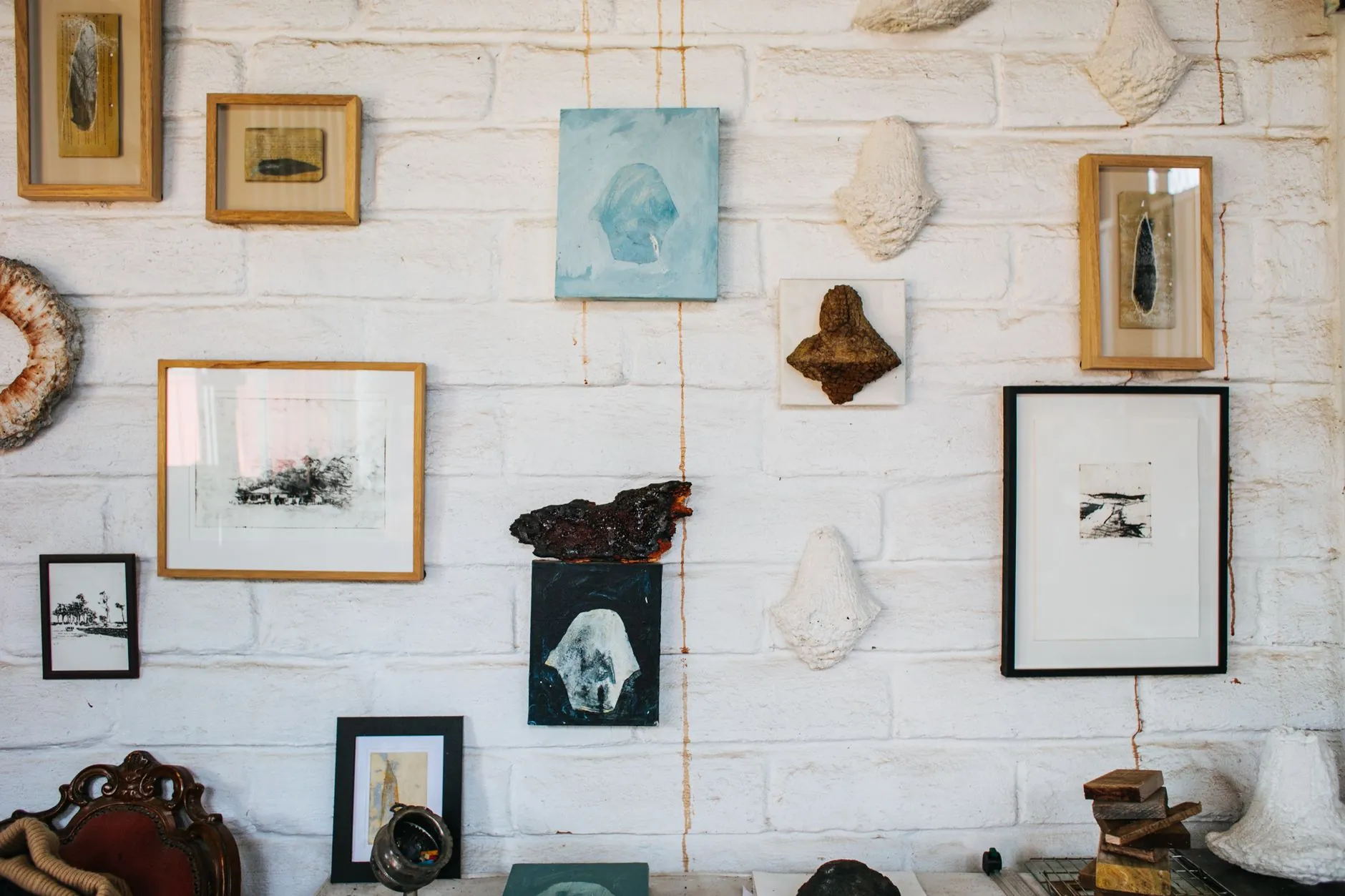
Two pieces of furniture with identical dimensions can have very different visual weight.
A heavy traditional wood cabinet with carved details feels more substantial than a slim minimalist console with exposed legs. Artwork should respond to that difference.
Rooms containing visually heavy furniture can usually support stronger artwork: larger dimensions, deeper colors, substantial frames, textured surfaces, or more expressive compositions.
With light, streamlined furniture, restraint often works better. Artwork with clean lines, generous negative space, subtle colors, or narrow frames can maintain the airy quality of the room.
This does not mean the artwork and furniture need to share the same design style. Contrast can be extremely effective. The important thing is that one element does not unintentionally overwhelm the other.
Use Color to Connect the Room
Matching artwork perfectly to furniture is rarely necessary and can sometimes make a room feel overly coordinated.
Instead, look for subtle relationships.
An artwork might repeat the warm tone of a leather chair, pick up a muted green from a rug, echo the black metal of a coffee table, or introduce a complementary color that gives a neutral room more energy.
A useful approach is to identify two or three colors already present in the space and consider whether the artwork relates to at least one of them.
Neutral rooms offer particularly interesting opportunities. Beige, cream, white, gray, and natural wood can provide a quiet backdrop for stronger artwork. Alternatively, a restrained monochromatic piece can reinforce a calm minimalist interior.
The goal is visual conversation rather than exact color matching.
Consider Your Interior Style Without Becoming Too Literal
Interior style provides direction, but it should not become a rigid rule.
In a minimalist room, simple geometric artwork, abstract compositions, monochromatic photography, or sculptural wall pieces can reinforce the clean architecture without introducing unnecessary visual noise.
Modern interiors often work well with bold abstract artwork, graphic forms, metal pieces, and larger-scale compositions.
Traditional rooms may naturally accommodate landscapes, botanical imagery, framed prints, and classic paintings, but contemporary artwork can also create an interesting contrast against traditional furniture.
Eclectic interiors allow even more freedom. The key is to find at least one common element, such as color, material, shape, scale, or mood, that connects seemingly different pieces.
Rather than asking whether an artwork belongs to the exact same style category as the furniture, ask whether the two look intentional together.
Get the Placement Right
Even correctly sized artwork can feel wrong when it is hung poorly.
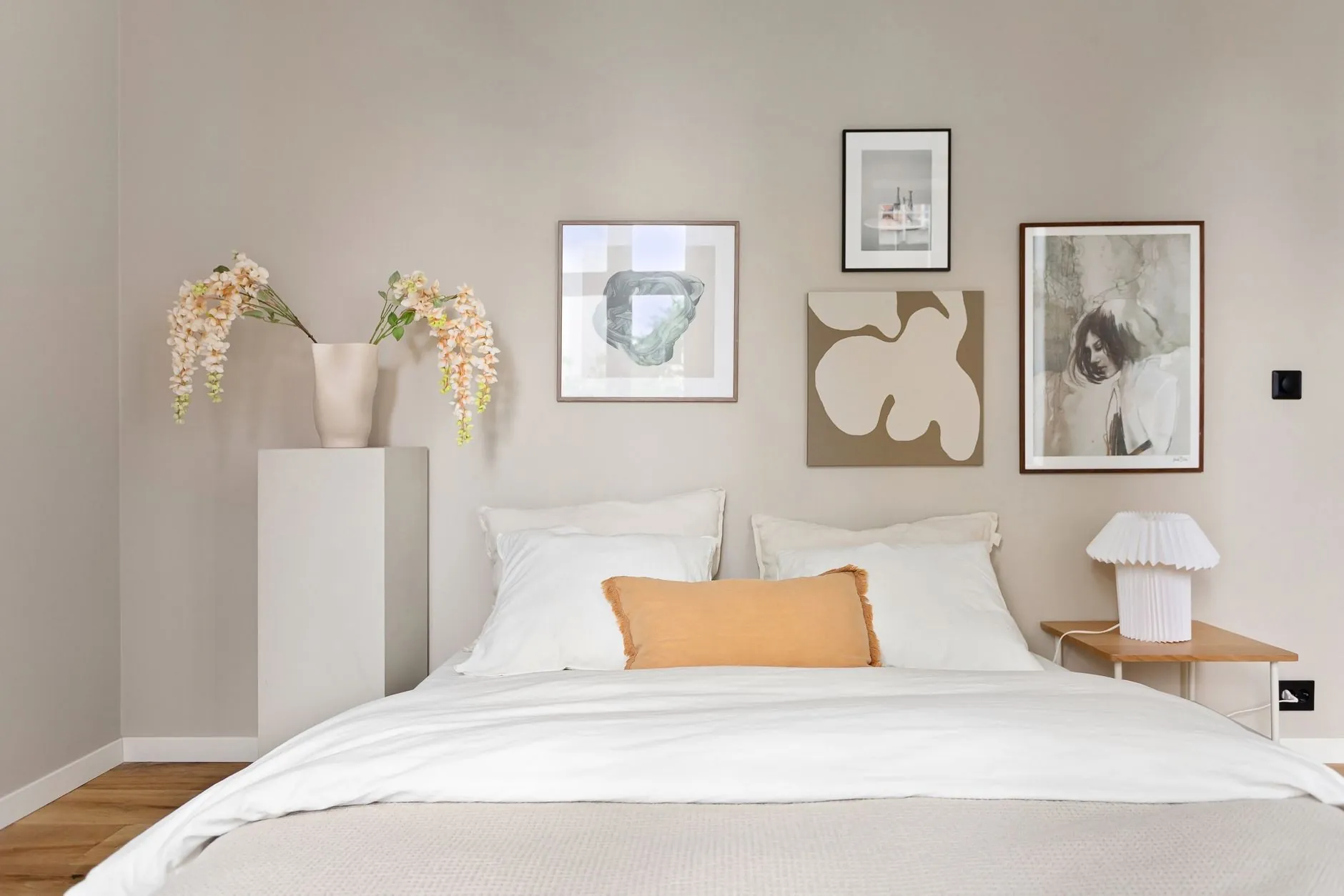
One of the most common mistakes is hanging art too high. Artwork should feel connected to the furniture beneath it rather than appearing to float near the ceiling.
When there is no furniture underneath, viewing height becomes more important. The center of the artwork should generally sit around comfortable eye level, although ceiling height, artwork dimensions, and the way people use the room can justify adjustments.
Spacing also matters when multiple pieces are displayed together. Treat a gallery wall or multi-panel arrangement as one larger composition. Consistent spacing usually creates a more deliberate result than scattering individual pieces across the wall.
Before drilling holes, use painter’s tape or paper templates to outline the proposed dimensions on the wall. Living with the outline for a day can reveal proportion problems that are difficult to notice while holding a piece in place.
Think About the Room From Multiple Angles
Wall art is rarely viewed from only one position.
A living-room piece might be visible from the entryway, dining area, hallway, and sofa. Artwork above a bed may also be visible through the bedroom door. Open-plan homes create even more overlapping sightlines.
Walk around the space before making a final decision.
Ask whether the artwork competes with another focal point, such as a fireplace, television, dramatic light fixture, or large window. Two strong elements placed too close together can compete for attention.
Sometimes moving artwork to a quieter wall creates a much stronger composition.
Avoid Filling Every Empty Wall
An empty wall is not necessarily an unfinished wall.
Rooms need visual pauses. When every surface contains artwork, shelving, mirrors, photographs, or decorative objects, individual pieces lose their impact.
Prioritize the walls that naturally attract attention: above a sofa, behind a dining table, over a console, at the end of a hallway, or opposite an entrance.
Leaving secondary walls relatively simple can make the important artwork feel more deliberate.
This is particularly useful in smaller rooms, where excessive wall decoration can make the space feel visually compressed.
Let the Room Develop Over Time
One of the easiest ways to create an interior that feels overly staged is to purchase every decorative element at once.
Wall art does not need to be completed immediately.
Living in a space for a while helps reveal which walls actually need something, what dimensions work best, and which colors or materials are missing from the room. It also allows a collection to develop from pieces you genuinely like rather than pieces purchased simply to fill space.
A thoughtful interior often contains a mixture of artwork collected at different times, provided there is enough visual connection to make the overall arrangement feel intentional.
Final Thoughts
Choosing wall art becomes much easier when you stop treating the wall as an isolated surface.
Start with the furniture. Consider scale and visual weight. Look for subtle relationships in color and material. Pay attention to placement and sightlines, and do not be afraid to leave some walls empty.
Most importantly, choose artwork that you actually want to live with. Decorating principles can help create balance, but the strongest interiors combine those principles with personality.
When furniture, artwork, and architecture relate to one another without appearing overly coordinated, the result is a room that feels comfortable, collected, and complete.











 Blankets and Throws
 Home Accessories
 Furniture
 Rugs
Rugs Cushions
 Kitchen
 Cutlery and Dinnerware
 Drinkware
 Table Mats and Coasters
 Dining Accessories
 Tablecloths and Napkins
 Decorative Items
 Vases and Planters
 Wall Decor
 Bathroom Accessories
 Bathroom Storage
 Bath and Shower Mats
 Towels