FREE WORLDWIDE TRACKED SHIPPING

Mauve Paint Ideas: How to Use Smoky Purple in Real Rooms
 By Laura Jones
Learn how to use mauve and smoky purple paint in real rooms, from choosing undertones to pairing colors with wood and testing them in different light.
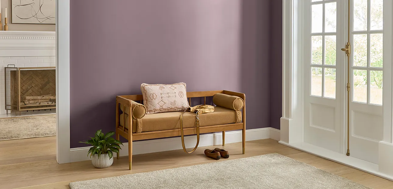
Image: Rust-Oleum.
A mauve paint chip can look like a quiet pink in the store and distinctly purple once it is next to your sofa. That shift is part of the color’s appeal, but it is also why choosing a shade for a real room takes more than picking a pretty square.
Start with the colors you cannot easily change: the floor, the largest pieces of furniture and the light you use after dark. Then decide whether you want mauve to act like a warm background or a deeper accent. A few samples, viewed in place, will tell you more than a screen ever can.
For 2027, Rust-Oleum has named Mauve Classic RO1130 its Wall Paint Color of the Year, describing it as a smoky mauve with a gray influence. It is one point on a much wider spectrum. Our 2027 Color of the Year tracker follows the brand announcements; here, the question is how to make these colors work with the room you already have.
What does mauve look like on a wall?
Mauve sits between pink and purple, often softened with gray, brown or a dusty quality. Some shades lean rosy; others look cooler and more violet. A smoky purple usually has more visible violet and a muted, gray or brown cast. The names on the label are starting points, not a reliable way to predict what will happen on your walls.
Put samples next to one another and look for the difference. The one that seems neutral alone may reveal a strong pink or blue character beside its neighbors. Stand back, too: a whole wall gives a color more presence than a chip held in your hand.
| Color family | Typical appearance | Try it when |
|---|---|---|
| Dusty mauve | Muted pink-purple, sometimes gray or brown | You want a soft backdrop with more color than beige |
| Smoky purple | Deeper or grayer violet | You want contrast on a wall, cabinet or door |
| Lavender | Usually lighter and more visibly blue-purple | You want a cooler, airier effect |
| Millennial pink | A broad name for muted blush pinks | You prefer pink to be the first impression |
| Plum | Deep red-purple, sometimes close to brown | You want a richer accent or an enveloping room |
These are useful descriptions, not strict technical boundaries. A paint called mauve can be pinker than a dusty pink, and a shade of lavender can be grayer than expected. Compare actual samples instead of buying by name.
Choose your mauve by undertone
For warm floors and furniture: try a rose-brown or earthy mauve beside the wood. It can sit comfortably with honey oak, walnut or terracotta, although an orange floor may make a rosy wall look cooler by comparison. If the combination feels too pink, try a sample with more brown or gray.
For a quieter, cooler room: try a gray-mauve with violet undertones. Check it against your existing gray upholstery: two grays with different undertones can make one another look unexpectedly blue, green or pink.
For a richer accent: look at plum or brown with a purple undertone. Dunn-Edwards’ French Press Coffee DEBN07, its 2027 pick, is a deep brown with a subtle plum undertone, not a pale mauve. Compare it with C2 Paint’s Pueblo C2-510, an earthy mauve: the two offer very different levels of depth even though both have a rosy or purple connection.
Where to use mauve and smoky purple
Living room: work from the largest fabric
Hold your sample against the sofa and curtains before choosing a wall color. For a light sofa and warm wood, try a muted mauve on all four walls with an off-white ceiling. If the sofa already has a strong pattern, take a small color cue from it and test a grayer shade on a single wall or the back of a bookcase first.
A dark purple can also work around a fireplace or on a cabinet, leaving the other surfaces lighter. Repeat a little of that color in a cushion or artwork so the accent does not feel isolated. For a room with an awkward footprint, solve the furniture layout before committing to a focal wall; our guide to arranging a long, narrow living room can help.
Bedroom: soften the contrast
A dusty mauve behind the bed can make a room feel settled without requiring a new headboard. Pair it with bedding in cream, oatmeal or a muted green, and introduce contrast through a dark wood nightstand or a patterned pillow. If you want a darker bedroom, try a smoky plum on a sample board by the bed and check whether you still like it under the lamps you actually use.
Light colors are not mandatory in a small bedroom. The more useful question is whether you enjoy the room in the morning and at night. For a deeper palette, see these dark bedroom ideas for balancing rich walls with practical lighting.
Dining room: give evening light a vote
A dining room often earns its keep after sunset, so review your samples with the pendant and any side lamps switched on. A brown-leaning mauve can look warm alongside a wood table and linen, while a smoky purple creates a clearer contrast with pale chairs. If the full room feels like too much, paint a sideboard or the wall inside an alcove instead.
Kitchen or bathroom: test beside fixed finishes
In a kitchen, compare mauve with the backsplash, counters, cabinet finish and floor at the same time. A soft mauve wall can be a useful counterpoint to wood cabinetry; a plum island or freestanding cupboard is a smaller commitment. Keep paint samples away from the decision until you have placed them next to those fixed surfaces.
In a bathroom, hold the sample against the tile and under the mirror light. A rosy mauve may flatter a warm stone; a cooler one may be better with a blue-gray tile. Use a paint suitable for the room’s conditions and follow the manufacturer’s surface and ventilation instructions.
Entryway or home office: start small
An entryway gives you a contained place to try color, but check the transitions to adjoining rooms. A mauve that looks lovely in the hall can look much more violet when framed by a warm white doorway. In an office, try a sample behind your desk and on the opposite wall; the surface you face all day deserves as much attention as the one visible on a video call.
Colors and materials that pair with mauve
- Warm whites: cream and soft off-white can make a rosy or earthy mauve feel gentle. Compare whites in the room; a very yellow white can emphasize violet in the wall color.
- Wood: walnut adds depth, while oak can keep the palette lighter. Look at the actual finish, especially if it is orange or red, before choosing the paint.
- Greens: muted sage and olive offer a quieter contrast; a deeper green gives the room more definition. Try a fabric or leaf-colored accessory before buying a second paint.
- Natural textures: linen, wool, matte ceramics and woven fibers introduce variation without adding another strong color.
- Metal: aged brass can warm the palette; blackened or silvery hardware can sharpen it. Existing hardware is a useful clue, not something you need to replace.
Pick one main direction and one accent rather than trying every pairing at once. For example, a mauve wall, warm-white curtains and walnut furniture can stand on their own; add a small olive cushion only if the room needs another note.
How to test mauve before painting the room
- Choose three samples that are visibly different: one rosy, one gray-violet and one brown-leaning. Include a lighter option than you think you need.
- Paint large movable boards with the intended finish, following the sample instructions. Leave a white border so the existing wall color interferes less with your comparison.
- Move the boards between at least two walls and put them next to the floor, trim and largest furniture piece. Do not rely on a sample sitting flat on a table.
- Check them in morning, afternoon and evening light. Turn on the bulbs you plan to use and compare with the curtains both open and closed.
- Live with the finalists for a few days. If the winner looks too purple only at night, test another sample or reconsider the lighting before buying the full amount.
Finish and surface texture also affect the result, so check the final product and sheen rather than assuming the sample will look identical everywhere. Our guide to why paint color looks different at night explains what to check when the evening version surprises you.
Try the color without painting
Renters, or anyone unsure about covering a wall, can try mauve through curtains, a removable lampshade, a throw or framed art. Bring the item into the room rather than judging it in a shop. A small piece will not tell you exactly how a painted wall will look, but it can show whether you like the color beside your furniture.
If it feels right, take the next step with a cabinet, a removable panel or a properly tested wall sample. The aim is to find a version of mauve that suits your home, not to reproduce a color forecast exactly.
Frequently asked questions
Is mauve a warm or cool color?
It can read either way. Brown and rose can make a mauve feel warmer, while blue and gray can make it feel cooler. Nearby materials and changing light influence the result, so compare samples in the room.
What is the difference between mauve and lavender?
Lavender is often a lighter, cooler purple. Mauve commonly has a pinker, dustier or browner appearance. Paint names are not standardized, so use the labels to narrow your search and then compare the colors themselves.
Does mauve go with gray?
Yes. Look closely at the gray’s undertone and compare it with the mauve in daylight and artificial light. If the pair feels cold or mismatched, try a warmer fabric, a brown-leaning mauve or a different gray.
Can mauve work in a small room?
Yes. A muted light shade can provide a soft backdrop, while a deep plum can make a small room feel more enclosed and intimate. Test both against the light and furnishings, then choose the atmosphere you prefer.





 Blankets and Throws
 Home Accessories
 Furniture
 Rugs
 Cushions

 Kitchen
 Cutlery and Dinnerware
 Drinkware
 Table Mats and Coasters
 Dining Accessories
 Tablecloths and Napkins

 Decorative Items
 Vases and Planters
 Wall Decor

 Bathroom Accessories
 Bathroom Storage
 Bath and Shower Mats
 Towels