FREE WORLDWIDE TRACKED SHIPPING
8 Benjamin Moore Paint Colors That Look Expensive (By the Numbers)
 By Alex Carter
Eight Benjamin Moore colors keep showing up on every list of paint that looks expensive. Their light reflectance values explain exactly why.
Photo: Thới Nam Cao / Pexels
A Benjamin Moore fan deck holds more than 3,500 named colors. Search for “paint colors that look expensive” and the fan deck effectively shrinks to eight. Cross-reference the brand’s own bestseller page against five independent retailer lists and three designer roundups, and the same codes keep resurfacing: White Dove, Chantilly Lace, Pale Oak, Revere Pewter, Stonington Gray, Kendall Charcoal, Hale Navy, Wrought Iron. That is not a coincidence of marketing. It is a pattern in one number every one of these colors shares a version of: light reflectance value, or LRV — the percentage of light a color bounces back, measured on a scale from 0 (absolute black) to 100 (absolute white).
Below is the exact spec for each color, pulled from Benjamin Moore’s own published data, followed by what the LRV numbers actually explain about why these eight read as expensive and what that costs in practice.
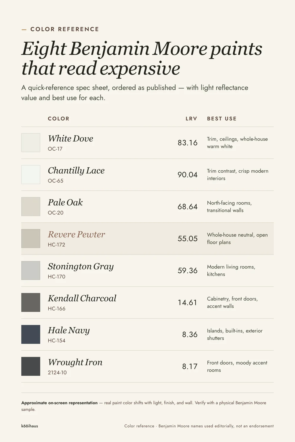
Quick Answer: The Eight Colors and Their Specs
| Color | Code | LRV | Family | Best Use |
|---|---|---|---|---|
| White Dove | OC-17 | 83.16 | Warm white | Trim, ceilings, whole-house warm white |
| Chantilly Lace | OC-65 | 90.04 | Bright white | Trim contrast, crisp modern interiors |
| Pale Oak | OC-20 | 68.64 | Warm greige | North-facing rooms, transitional walls |
| Revere Pewter | HC-172 | 55.05 | Neutral greige | Whole-house neutral, open floor plans |
| Stonington Gray | HC-170 | 59.36 | Silvery gray | Modern living rooms, kitchens |
| Kendall Charcoal | HC-166 | 14.61 | Charcoal gray | Cabinetry, front doors, accent walls |
| Hale Navy | HC-154 | 8.36 | Deep navy | Islands, built-ins, exterior shutters |
| Wrought Iron | 2124-10 | 8.17 | Soft black | Front doors, moody accent rooms |
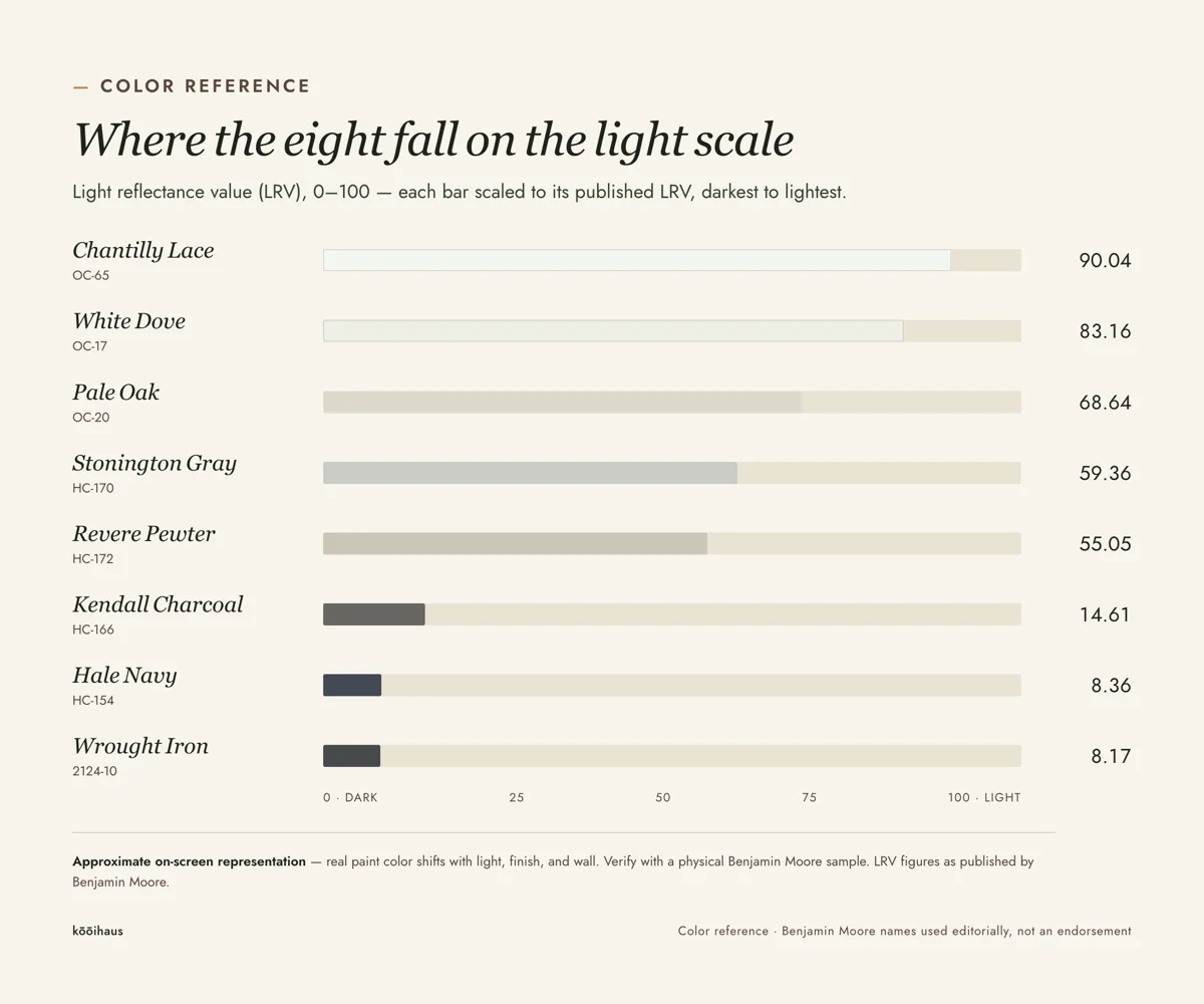
The Actual Mechanism: What “Expensive” Means in LRV Terms
Plot these eight colors on a light-reflectance scale and a gap appears. Five sit above LRV 55 or below LRV 15. Almost none sit in the 20-to-50 range, which is exactly where most budget “greige” and “builder beige” paints land — the muddy middle where a color is too dark to read as a clean neutral and too light to read as an intentional deep tone. Designers are not choosing these eight colors for their names. They are avoiding the middle of the scale, where undertones fight each other and a wall reads indecisive rather than considered.
The second pattern is undertone discipline. Every color on this list is described in Benjamin Moore’s own copy with a single, named undertone — Pale Oak’s “warm gray,” Stonington Gray’s “relatively neutral,” Revere Pewter’s “bridge between warm and cool.” None of the eight is marketed as multi-directional or “changes with the light” in the way many mid-tier neutrals are. A paint that shifts between three different colors across a day photographs unpredictably and reads cheap in person, because the eye reads instability as a flaw. A color that holds one identifiable undertone under changing light reads controlled, and control is what “expensive” actually measures.
The third factor is contrast pairing, which the LRV numbers make measurable rather than aesthetic. White Dove at 83 LRV against a Chantilly Lace trim at 90 LRV is a seven-point gap — enough to separate wall from trim without the stark, high-contrast look of a true white-on-white. Kendall Charcoal at 14.61 against white trim near 85 is closer to a 70-point gap, the kind of high-contrast pairing used deliberately on cabinetry and front doors, where a hard edge reads as design intent rather than accident. Rooms that photograph as expensive tend to hold a deliberate LRV gap between wall, trim, and cabinetry — not the near-zero gap of an all-one-color rental repaint, and not a random gap from mismatched sheens. For a broader field of these tonal relationships across brands, the full guide to the best neutral paint colors of 2026 covers non-Benjamin Moore options that follow the same LRV logic.
The Eight Colors, Grouped by Light Reflectance
The Warm Whites (LRV 83–90)
White Dove (OC-17, LRV 83.16) is the most-used trim and wall white in the group, and the reason is in the number: at 83 LRV it is warm enough not to look sterile under LED light but reflective enough to keep small rooms from feeling closed in. It is the base color behind the popular layered white interior look, where several near-white shades are used in the same room instead of one flat white.
Chantilly Lace (OC-65, LRV 90.04) is Benjamin Moore’s brightest practical white and reads cooler and crisper than White Dove. It is the choice when the goal is maximum contrast against a dark floor or black hardware, not warmth. Used as a whole-wall color, it can read clinical in north-facing rooms with limited natural light; it does its best work as trim against a mid-tone wall.
The Greiges and Silvery Grays (LRV 55–69)
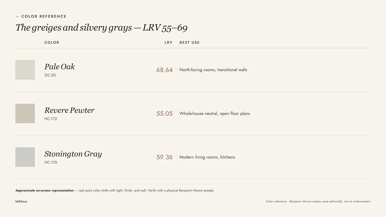
Pale Oak (OC-20, LRV 68.64) is the lightest greige on the list and the one most often chosen for north-facing rooms, where pure beige tends to shift yellow and pure gray tends to shift blue. Its 68.64 LRV keeps it close to a warm white while its named “warm gray” undertone stops it from reading as an off-white.
Revere Pewter (HC-172, LRV 55.05) has been a top seller for over a decade for a specific reason: at 55 LRV it sits almost exactly at the midpoint of the whole scale, which is why it reads as genuinely neutral rather than warm-leaning or cool-leaning under most bulbs. That neutrality is also its limit — in a room with very little daylight, a true 50-to-55 LRV color can go flat rather than warm or moody, landing in neither camp.
Stonington Gray (HC-170, LRV 59.36) reads more silver than Revere Pewter’s beige-gray lean, and is the more common choice in kitchens and bathrooms where cooler light fixtures already set the tone. Benjamin Moore’s own description calls it “relatively neutral,” which the LRV backs up: at 59 it sits close enough to Pale Oak and Revere Pewter to move between rooms in the same house without a visible seam.
The Deep Anchors (LRV 8–15)
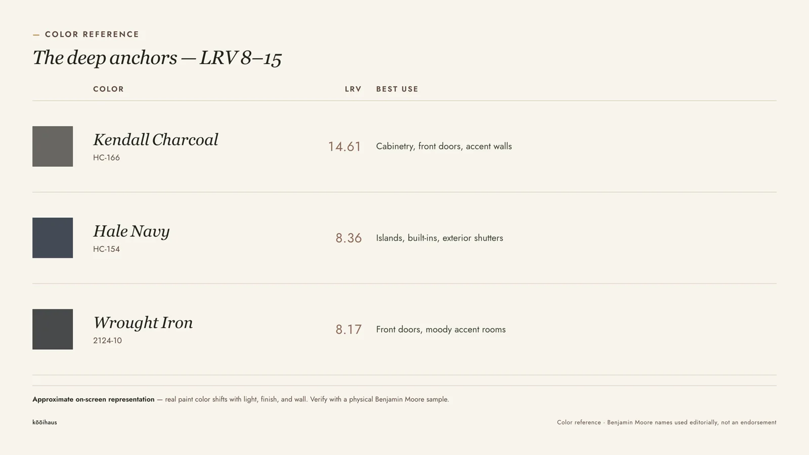
Kendall Charcoal (HC-166, LRV 14.61) is the lightest of the three deep tones and the most forgiving in a full room, since 14.61 still reflects enough light to avoid the cave effect that colors under LRV 10 can produce in a space with one window. It is the most common of the three for a full accent wall rather than trim or cabinetry alone.
Hale Navy (HC-154, LRV 8.36) and Wrought Iron (2124-10, LRV 8.17) sit within two-tenths of a point of each other on the reflectance scale, which is why they photograph almost identically in low light and only separate under direct sun, where Hale Navy shows its blue undertone and Wrought Iron stays closer to true neutral black. Both need real daylight or layered lighting to avoid reading as a flat void; used on an island, a door, or built-ins rather than four walls, that low LRV becomes the point rather than the problem, and pairs naturally with the practical planning covered in the guide to quiet luxury interior design, where restraint and material quality matter more than color intensity.
The Trade-Off the Photos Don’t Show
An LRV under 20 is not free. Deep bases require more tint concentrate per gallon, which typically costs more than a pastel base at the same retailer, and they need a gray or tinted primer — not standard white primer — to avoid a patchy, uneven first coat. Budget two coats minimum over primer for anything under LRV 15; three coats is common on a color change from a light wall. None of that shows up in a styled photo, but it shows up in the invoice and the timeline. For anyone estimating a full room or exterior trim run in one of the deep anchors, the paint coverage calculator accounts for the extra-coat requirement rather than assuming one coat like a standard light neutral.
Low-LRV rooms also show wear differently. Scuffs and nail holes are more visible against a dark, flat-finish wall than against a mid-tone one, which is why deep colors are more often specified in eggshell or satin than flat, and why cabinetry and doors — surfaces touched constantly — usually go semi-gloss regardless of the base color. The trade is real: a room that reads considered in a photograph asks for a higher-maintenance finish in daily use.
On the light end, the trade is different. White Dove and Chantilly Lace at 83 and 90 LRV show dirt, drag marks, and uneven touch-ups more readily than a mid-tone wall, simply because there is more contrast between clean paint and any mark on it. Exterior trim in either white needs more frequent washing to keep the reflectance reading clean rather than chalky; anyone estimating exterior repaint quantities can cross-check against the exterior house paint estimate guide before ordering.
How to Use the LRV Pattern Without Copying the List
The eight codes above are a starting point, not a rule. The transferable finding is the pattern: pick a color from the top or bottom third of the LRV scale rather than the middle, confirm the undertone is named and singular rather than “shifts with light,” and set a deliberate reflectance gap between wall, trim, and any built-in or door. A color in the 25-to-45 LRV range can still work — plenty of rooms use one well — but it asks for more testing, because that band is where undertone conflicts are hardest to predict from a small chip. Test a full sample board in the room at three times of day before committing a full gallon order.
Frequently Asked Questions
What is Benjamin Moore’s most popular neutral color?
Revere Pewter (HC-172, LRV 55.05) has held bestseller status for over a decade, largely because its near-midpoint LRV reads as genuinely neutral rather than warm- or cool-leaning under most lighting.
Do darker Benjamin Moore colors need more paint?
Yes. Colors under roughly LRV 20 typically need a tinted primer and two to three finish coats, versus one to two coats for a light neutral over existing light paint. Budget accordingly when estimating gallons.
What sheen looks the most expensive?
For walls, eggshell or satin in any of the eight colors above reads more intentional than flat, since flat shows scuffing fastest on both very light and very dark colors. Trim and doors typically go semi-gloss regardless of wall sheen.
Is a lower LRV always a darker, moodier room?
Not necessarily on a single surface. Kendall Charcoal on one accent wall or a set of built-ins reads as a deliberate anchor; the same LRV across four walls with limited daylight can read as a cave. The fix is lighting layering, not avoiding the color.
The fan deck still holds 3,500 colors. Only a handful sit at the ends of the reflectance scale with a single clean undertone — and that, measurably, is what an expensive-reading room is actually made of.











 Blankets and Throws
 Home Accessories
 Furniture
 Rugs
Rugs Cushions
 Kitchen
 Cutlery and Dinnerware
 Drinkware
 Table Mats and Coasters
 Dining Accessories
 Tablecloths and Napkins
 Decorative Items
 Vases and Planters
 Wall Decor
 Bathroom Accessories
 Bathroom Storage
 Bath and Shower Mats
 Towels