FREE WORLDWIDE TRACKED SHIPPING
The Scandinavian Design Trends Defining 2026
 By Alex Carter
Scandinavian design in 2026 is moving beyond pale minimalism toward warmer color, tactile craft, adaptable furniture, and lighting with real presence.

The useful story in Scandinavian design for 2026 is not the death of minimalism. It is a correction: interiors are becoming warmer, more materially expressive and more adaptable while keeping the Nordic commitment to legible function.
This is an editorial assessment based on the official launch information and the current design context, not a hands-on product test. Availability, price and specifications can vary by market, so verify the local product page before purchasing.
What is confirmed
- Recent 2026 trend coverage points toward stronger color, craft, expressive wood and more individualized rooms.
- Current IKEA launches emphasize playful functionality, adaptable objects and lamps with material presence.
- Bamboo, ceramic, textile shades, visible grain and modular forms show how texture and function are converging.
- These are editorial signals rather than rules; a room should adopt only the shifts that solve a real spatial or emotional need.
The distinction between confirmed facts and interpretation matters. Launch materials tell us what exists and how the brand positions it; they do not prove long-term durability, comfort or value. The analysis below therefore focuses on design logic, room fit and questions a buyer can verify independently.
The quick design read
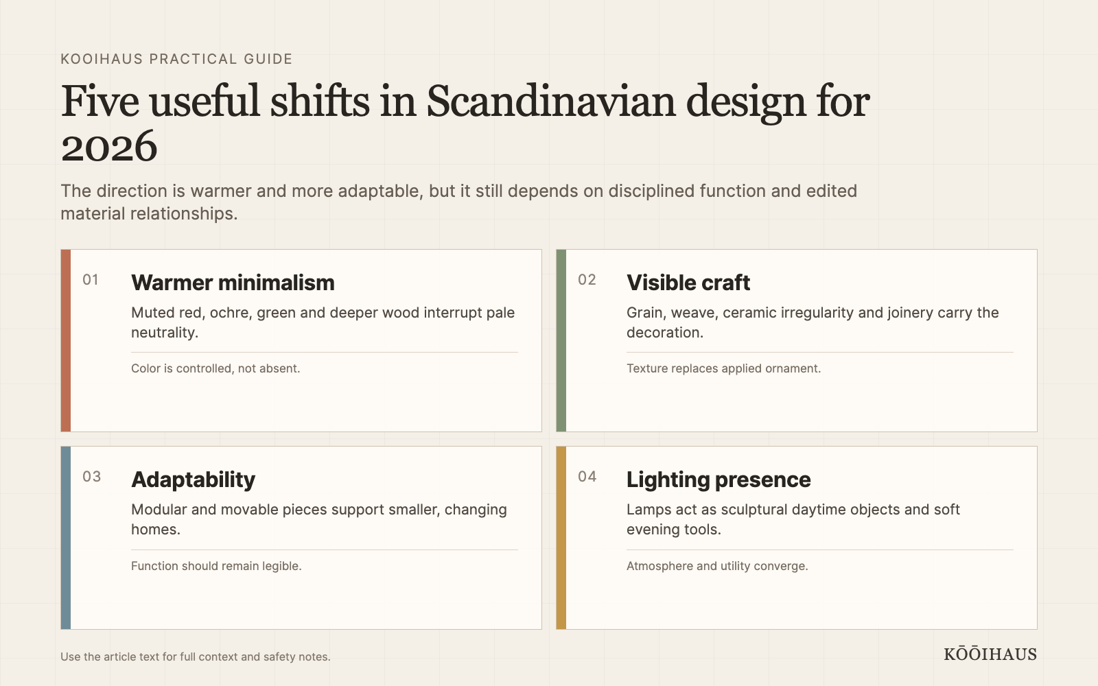
| Area | What matters | Practical check |
|---|---|---|
| Color | Muted warm accents and deeper woods | Add one controlled contrast |
| Material | Visible grain, weave and ceramic texture | Let construction carry decoration |
| Furniture | Modular, movable, multi-use forms | Test the mechanism in daily life |
| Lighting | Sculptural shades and soft layered light | Plan fixture, bulb and position together |
Warm minimalism replaces blank minimalism
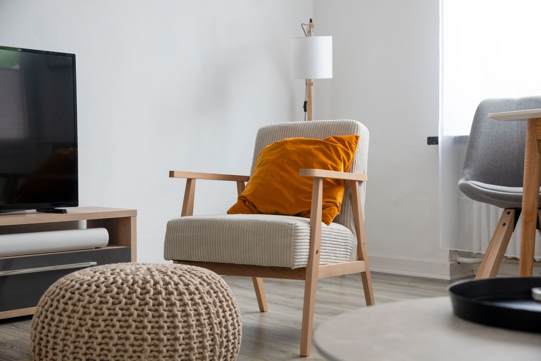
White, gray and pale oak are no longer the only shorthand for Scandinavian calm. Muted red, dusty blue, forest green, ochre and darker woods add emotional weight without requiring maximalism. The important move is controlled contrast: one colored cabinet, a wool textile or a painted dining chair can activate a restrained room. Warmth comes from relationships between materials, not from filling every surface.
The practical test is whether this idea improves light, circulation, maintenance or comfort in a real room. It should not be adopted solely because it appears in a new collection or forecast. Measure the space, compare the material and keep enough visual quiet for the design move to register.
Craft becomes the visible ornament
Woven fibers, ceramic variation, carved edges and expressive grain allow simple forms to feel specific. This does not require handmade objects everywhere. It means choosing a few surfaces where construction is visible and resisting printed imitation when the real material is available. A linen curtain, wool throw or solid-wood stool can carry more depth than several decorative signs or trend objects.
The practical test is whether this idea improves light, circulation, maintenance or comfort in a real room. It should not be adopted solely because it appears in a new collection or forecast. Measure the space, compare the material and keep enough visual quiet for the design move to register.
Furniture is expected to adapt
Smaller homes, hybrid work and changing households reward pieces that move, fold, stack or serve more than one setting. IKEA PS 2026 makes playful functionality explicit, but the principle reaches beyond one collection. Adaptability is useful only when the mechanism is simple and the object remains comfortable. A clever transformation that takes ten steps will become static furniture.
The practical test is whether this idea improves light, circulation, maintenance or comfort in a real room. It should not be adopted solely because it appears in a new collection or forecast. Measure the space, compare the material and keep enough visual quiet for the design move to register.
Lighting becomes architecture at a smaller price
The latest bamboo, ceramic and textile-shaded lamps show lighting acting as a spatial object even during the day. A pendant can define a dining zone; a wall lamp can free a bedside surface; a floor lamp can make a reading corner without construction. At night, warm, dimmable light reveals texture and lowers contrast. The fixture, bulb and placement should be planned together.
The practical test is whether this idea improves light, circulation, maintenance or comfort in a real room. It should not be adopted solely because it appears in a new collection or forecast. Measure the space, compare the material and keep enough visual quiet for the design move to register.
Individual rooms replace the universal Nordic template
The strongest Scandinavian rooms no longer look copied from one pale catalog. They combine inherited objects, local art, travel finds and modern utility within a disciplined structure. Negative space remains important, but it is used to frame personality rather than erase it. This is a healthier direction because it asks what the household values instead of what a style label requires.
The practical test is whether this idea improves light, circulation, maintenance or comfort in a real room. It should not be adopted solely because it appears in a new collection or forecast. Measure the space, compare the material and keep enough visual quiet for the design move to register.
How to use the idea without copying the campaign
Start with the room’s existing problem. If the issue is flat, cold light, test a more tactile shade or a second lower light source. If the issue is a visually noisy small bedroom, choose one patterned anchor and make the surrounding layers quieter. If the room lacks warmth, add one material with visible grain or weave before changing the entire palette.
Photograph the room in daylight and at night. Campaign imagery is optimized for a particular angle, exposure and styling density; your room must work from several viewpoints and under ordinary bulbs. A two-day mock-up with existing objects often reveals whether the trend is solving the problem or merely changing the photograph.
What to verify before buying
- Exact dimensions, material composition and care instructions.
- Market-specific price, availability and return conditions.
- Bulb, power, installation or mattress compatibility where relevant.
- Whether the product remains useful after the coordinated collection or trend moment passes.
- Whether one item can provide the intended effect without requiring a full room reset.
Translate the launch into a room decision
New collections compress many choices into one persuasive image: material, palette, lighting, styling and a narrative arrive together. Separate them before deciding what you actually like. Save the image, then list its components without brand names. You may discover that the useful idea is a low warm lamp, a single patterned duvet, a darker wood tone or a movable side table rather than the featured product itself.
Next, compare the idea with what the room already owns. Reusing an existing lamp with a better bulb, rotating bedding between seasons or moving a textured object into a flatter room may deliver most of the effect. If a purchase remains justified, define its role and maximum dimensions before browsing local availability. This protects the room from becoming a sequence of unrelated launches.
Allow time to test visual novelty. A product that feels exciting on announcement day can feel loud once it occupies a small room every morning. Place a similarly sized object or textile in the intended position for forty-eight hours. Note circulation, reflected light, cleaning access and whether the rest of the room suddenly demands more changes. Good design reduces friction; it should not create a chain of corrective purchases.
Finally, retain the packaging, care details and order record until the item has been inspected in real light. Check finishes, seams, stability, electrical compatibility or textile dimensions as appropriate. Editorial enthusiasm is useful for discovering possibilities, but the buyer’s job is to verify the specific object that arrived.
Frequently asked questions
Is Scandinavian design still minimalist in 2026?
Yes, but the minimalism is warmer and more personal. Function and editing remain central while color and texture gain presence.
Which colors feel current?
Muted reds, earthy ochres, forest greens, dusty blues and deeper wood tones are useful accents alongside familiar neutrals.
Do I need to replace pale wood furniture?
No. Add contrast through one darker piece, textile, lamp or wall color. A layered room is more durable than a total trend reset.
How is this different from Japandi?
The styles overlap in restraint and natural materials, but current Scandinavian direction is often more playful, colorful and modular. Japandi usually emphasizes quieter asymmetry and a stronger Japanese craft reference.
Bottom line
The news is worth attention when it points to a durable design principle: better light control, useful coordination, honest material, adaptable function or a warmer relationship between objects. Treat the launch as evidence of a direction, then make the smallest change that improves the room on its own terms.
Sources
- Livingetc Scandinavian design trends 2026
- IKEA VARPTROSS official newsroom
- IKEA PS 2026 official newsroom
- IKEA HÅLGATT official newsroom










 Blankets and Throws
 Home Accessories
 Furniture
 Rugs
Rugs Cushions
 Kitchen
 Cutlery and Dinnerware
 Drinkware
 Table Mats and Coasters
 Dining Accessories
 Tablecloths and Napkins
 Decorative Items
 Vases and Planters
 Wall Decor
 Bathroom Accessories
 Bathroom Storage
 Bath and Shower Mats
 Towels