Why Paint Color Looks Different at Night (and How to Fix It)
 By Alex Carter
Learn why wall color shifts after sunset and how to test Kelvin, CRI, bulb type, placement, and paint samples before repainting
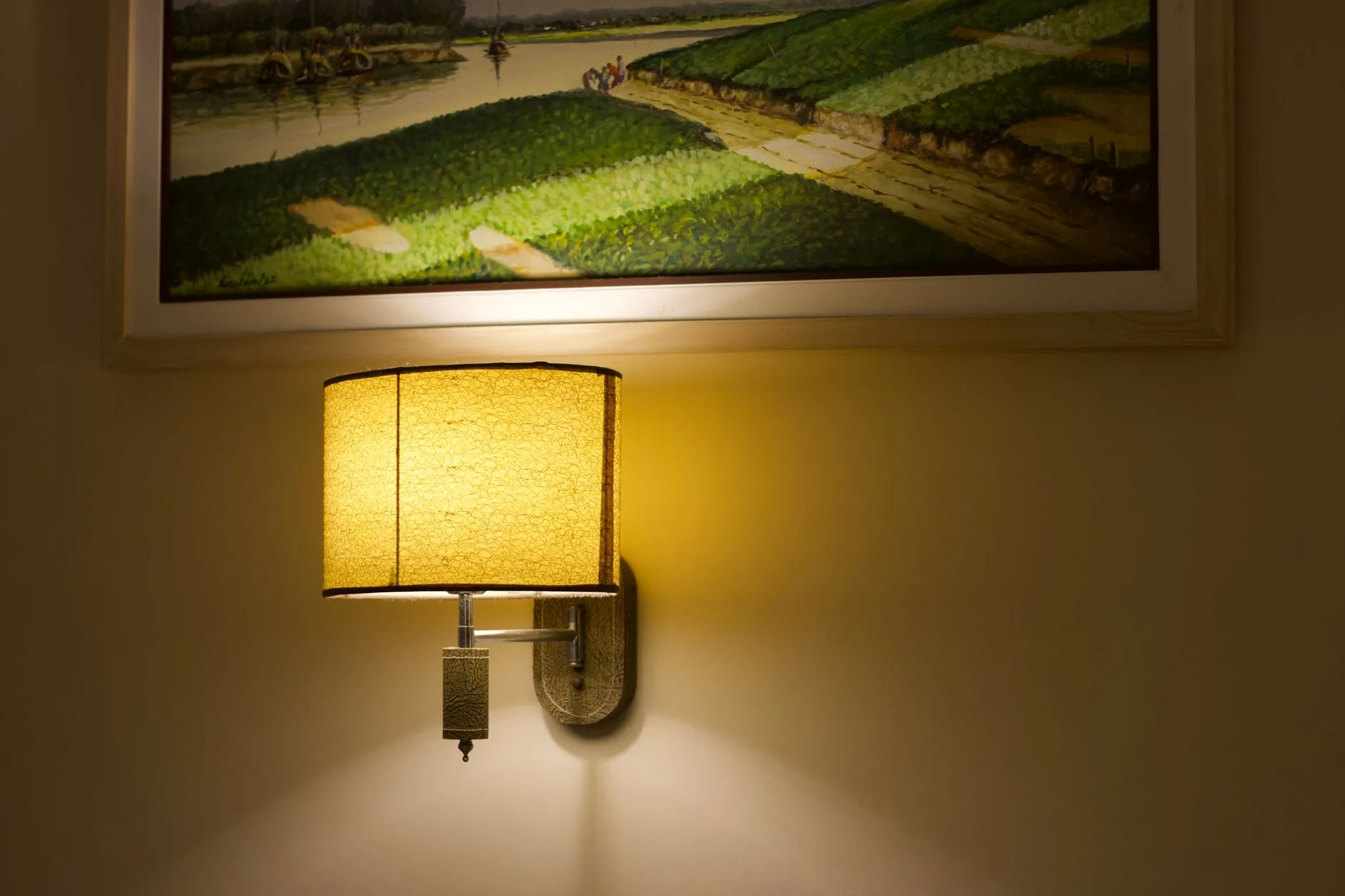
Photo by Rashed Hossain on Pexels
You liked the paint sample in daylight. Then evening arrived, the lamps came on, and the wall turned dull, yellow, green, gray, or strangely flat. The paint has not changed. The light reaching it has.
Paint color looks different at night because electric light has a different spectrum, color temperature, direction, and intensity from daylight. The fastest fix is not automatically a new paint color. First, test the room with one consistent bulb family, good color rendering, and the lamps you actually use after dark.
Why the same paint changes after sunset
We never see paint in isolation. We see the light that bounces off it. Daylight changes by hour, weather, window direction, glazing, and reflected outdoor surfaces. At night, that complicated source is replaced by a smaller set of bulbs, each with its own spectral output.
A paint chip may contain quiet blue, red, yellow, or green undertones that broad daylight balances. A warm lamp can strengthen reds and yellows while muting blues. A cooler lamp can sharpen blue and green notes while making a warm neutral feel flatter. Low light also reduces our ability to separate close colors, so a nuanced greige may collapse into plain gray.
This is why the problem often appears larger on a full wall than on a chip. The wall receives light at several angles, catches shadows, and sits beside flooring, wood, upholstery, and trim that reflect their own color back into it.
Kelvin changes which undertones move forward
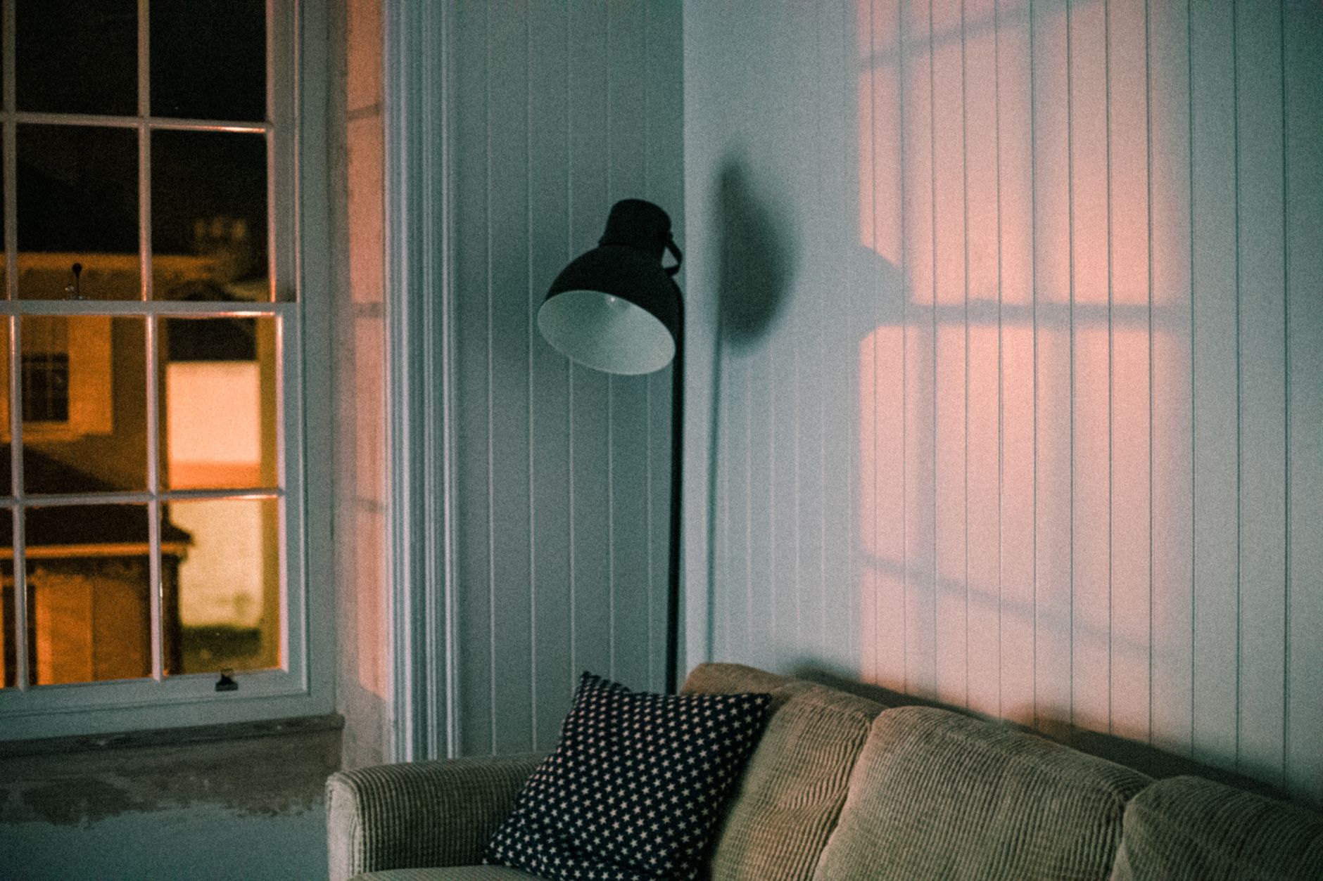
Correlated color temperature, listed in kelvins (K), describes whether white light appears warm or cool. A 2700K bulb looks warm and slightly amber. A 3000K bulb is still warm but cleaner. A 3500K bulb is more neutral. A 4000K bulb reads cooler and crisper in most homes.
Kelvin is not a quality score, and higher is not automatically more accurate. It is a visual bias. Warm white often flatters wood, terracotta, cream, red, and warm beige. It can pull yellow from an off-white or make a cool gray appear muddy. Cooler white can clarify blue-gray, green, and clean white, but may drain warmth from camel, clay, or blush.
For most living rooms and bedrooms, 2700K to 3000K remains comfortable. If the wall repeatedly goes too yellow at 2700K, test 3000K before jumping to 4000K. That small step often preserves a relaxed evening atmosphere while cleaning up the paint.
This is a different decision from choosing a bulb for one specific meal setting. Our guide to dining-room color temperature deals with that room’s narrower comfort range; here, the target is a wall color that still makes sense across several evening activities.
CRI matters, but it is not the whole answer
The color rendering index (CRI) estimates how faithfully a light source renders a set of colors compared with a reference source. On household packaging, 80 CRI is common; 90+ CRI is the more useful starting point when paint, art, textiles, wood tones, or skin tones matter.
Two bulbs can share the same 3000K label and still render a wall differently. One may reproduce reds well but leave saturated colors weak. Another may have a fuller spectrum and make subtle undertones easier to distinguish. CRI is therefore a screening tool, not a guarantee. When possible, compare bulbs from the same high-CRI product line rather than mixing brands around the room.
Brightness matters too. A high-CRI bulb dimmed until the wall is barely illuminated cannot reveal much color. Aim light onto the vertical surface, not only onto the floor or ceiling.
Bulb type, diffusion, dimming, and placement change the wall
The label on the bulb is only the start. A clear bulb in an open sconce creates a concentrated pool of light and hard shadow. A frosted bulb or shade spreads the light more evenly. A floor lamp placed close to one wall produces a steep brightness gradient; the same lamp pulled away may make the color read more consistently.
Dimming can also change color. Standard dimmable LEDs usually reduce output while keeping roughly the same color temperature. Warm-dim products deliberately become warmer as they dim. That can be beautiful, but it means the paint will shift more as the evening progresses. Tunable-white bulbs let you alter Kelvin independently, which is useful for testing, although the final setting should still be simple enough to live with. Our guide to lighting design trends and warm dimming explains that distinction in more detail.
If you are planning several ceiling lights, use the Kooihaus recessed lighting calculator to estimate quantity and spacing, then add wall-directed light. A mathematically bright room can still make paint look lifeless if every beam ends on the floor.
| What you see at night | Likely lighting cause | First test |
|---|---|---|
| Off-white turns yellow | Very warm bulbs or warm-dim setting | Compare 2700K with 3000K at equal brightness |
| Greige turns flat gray | Low light on the wall or weak red rendering | Add a high-CRI wall-directed lamp |
| Blue turns green | Warm source suppressing blue | Test 3000K or 3500K without mixing bulb families |
| One wall looks wrong | Uneven beam, shade color, or reflected surface | Move or diffuse the nearest lamp |
| Color changes as you dim | Warm-dim bulb or very low illumination | Test at the evening level you use most |
Choose bulbs for honest color after dark
Start with the room’s purpose, then narrow the specification. For relaxed living spaces, try 2700K or 3000K, 90+ CRI, and enough lumens to illuminate walls as well as tasks. For a workspace where matching color matters, 3500K can be useful if the cooler appearance suits the room.
Use one color temperature within a connected sightline. A 2700K floor lamp beside a 4000K ceiling light does not average into a balanced 3350K room; it creates separate warm and cool zones, and the wall changes as you walk between them. Consistency is more valuable than chasing a perfect number.
Also check the shade. Cream fabric, amber glass, painted metal, and dark paper all alter the light that escapes. If the bulb looks accurate without the shade but the wall changes when the shade returns, the shade is part of the color system.
Run a two-evening paint sample test
- Make large movable samples. Paint two coats on white foam board or heavy card, leaving a white border. A sample around 18 by 24 inches is easier to judge than several tiny chips.
- Place them on more than one wall. Test beside the window, on the darkest wall, and near the main evening lamp. Do not paint many competing swatches directly beside one another.
- Use the real bulb setup. Turn off temporary lights and use the lamps, shades, dimmer level, and curtains you expect to keep.
- Compare one variable at a time. On the first evening, compare 2700K and 3000K bulbs with similar lumens and CRI. On the second, keep the better Kelvin and compare placement or diffusion.
- Check neighboring materials. Hold the sample beside the sofa, rug, wood floor, trim, and largest artwork. Reflected color is often the hidden variable.
- Photograph only as a record. Phone cameras automatically alter exposure and white balance. Trust the in-room comparison, not which screenshot looks prettiest.
This same test matters when you are considering a trend color. The Color of the Year 2027 tracker records the announcements, but no campaign photograph can tell you how a color will behave under your evening bulbs.
When daytime and nighttime needs conflict
A room does not need to look identical at noon and 9 p.m. It needs to remain intentional. If a warm neutral becomes richer at night, that may be a benefit. The warning sign is when the shift erases the relationship you chose: green becomes gray, cream becomes nicotine yellow, or a dark color loses all edge definition.
Fix the light before repainting when the wall looks good in daylight and wrong only under one lamp. Reconsider the paint when it fails in several daylight conditions and under a consistent, high-quality evening setup. For dark rooms, our dark bedroom guide explains how wall lighting, contrast, and finish prevent a deep color from becoming cave-like.
The useful question is not whether the bulb makes the paint perfectly accurate. It is whether the room preserves the color relationship you intended when you actually use it. Test that relationship after sunset, and the wall stops being a surprise.
Frequently asked questions
What light bulb makes paint colors look most accurate?
A 90+ CRI LED from a consistent product line is a strong starting point. Choose 2700K to 3000K for most relaxed living spaces, or test 3500K where a more neutral working light is appropriate. Placement and brightness still matter.
Why does gray paint look green or blue at night?
Gray paints contain undertones. A bulb’s spectrum can emphasize one undertone and suppress another, while nearby flooring and furnishings reflect additional color onto the wall. Compare a different Kelvin at the same brightness before changing the paint.
Is 3000K or 4000K better for seeing true paint color?
Neither is universally truer. A high-quality 3000K bulb often works better in living spaces because it is neutral enough to clarify color without feeling clinical. A 4000K source can suit task spaces but may make warm finishes look cooler.
Should every bulb in a room have the same color temperature?
Usually, yes, especially when the fixtures illuminate the same walls. Matching Kelvin and product family reduces visible color zones. A deliberate warm accent can work, but accidental mixing makes paint harder to judge.



 Blankets and Throws
 Home Accessories
 Furniture
 Rugs
 Cushions

 Kitchen
 Cutlery and Dinnerware
 Drinkware
 Table Mats and Coasters
 Dining Accessories
 Tablecloths and Napkins

 Decorative Items
 Vases and Planters
 Wall Decor

 Bathroom Accessories
 Bathroom Storage
 Bath and Shower Mats
 Towels