Color of the Year 2027: Every Announcement, Tracked
 By Alex Carter
Every official Color of the Year 2027 pick, tracked in one place — from Valspar’s Cottage Door to the brands still to reveal — with what each color actually means for a real room.
Photo: Din / Pexels
Updated September 30, 2026
The first useful number in the 2027 Color of the Year season was 26. That is the light reflectance value of Valspar’s Cottage Door, the first confirmed 2027 paint pick from a major US brand. Since then, ten more organizations have named an official 2027 color: Sherwin-Williams, Behr, Dutch Boy, Dulux, Glidden/PPG, Graham & Brown, California Paints, Clark+Kensington, and PPG on the paint side, plus WGSN & Coloro’s cross-industry pick.
These are still not equivalent announcements. A retail paint Color of the Year, a cross-industry color forecast, and a 48-color trend palette are three different kinds of statement, and this tracker keeps them labeled separately rather than treating them as one list.
As of September 30, 2026, eleven of the sixteen paint and color authorities tracked here have named a 2027 Color of the Year: Valspar, WGSN & Coloro, Sherwin-Williams, Behr, Dutch Boy, Dulux, Glidden/PPG, Graham & Brown, California Paints, Clark+Kensington, and PPG.
The 2027 Color of the Year announcements so far
| Company | 2027 selection | Status | What was actually announced |
|---|---|---|---|
| Valspar | Cottage Door 8004-38E | Confirmed | Official paint Color of the Year |
| WGSN & Coloro | Luminous Blue 125-28-38 | Confirmed | Cross-industry color forecast, not a retail paint formula |
| Sherwin-Williams | Celery SW 6421 | Confirmed | Official paint Color of the Year, named with HGTV Home by Sherwin-Williams |
| Behr | Grounded T27-01 | Confirmed | Official paint Color of the Year |
| Dutch Boy | Deep Rooted 311-7DB | Confirmed | Official paint Color of the Year |
| Dulux | Soulful Sage | Confirmed | Official paint Colour of the Year |
| Glidden / PPG | Artifact PPG10-16 | Confirmed | Official paint Color of the Year, also carried under PPG’s Pittsburgh Paints brand |
| Graham & Brown | Rose Earth | Confirmed | Official paint Colour of the Year |
| California Paints | Quiet Peace | Confirmed | Official paint Color of the Year |
| Clark+Kensington | Vantage Point 38B-4 | Confirmed | Official paint Color of the Year, sold through Ace Hardware |
| PPG global | Country Soil PPG15-30 | Confirmed | Global PPG Color of the Year, separate from Glidden / Pittsburgh Paints Artifact |
| Benjamin Moore | Not announced | Waiting | Current official program remains focused on 2026 |
| Pantone | Not announced | Waiting | No official 2027 selection published |
| Dunn-Edwards | Not announced | Waiting | No official 2027 selection published |
| C2 Paint | Not announced | Waiting | 2026 pick was Epernay #639; no 2027 selection published |
| Little Greene | Not announced | Waiting | No official 2027 selection published |
This tracker counts a color only when the company identifies it as its official 2027 Color or Colour of the Year. Trend palettes, predictions, retailer edits, and colors with “2027” inside an existing product code do not qualify.
Valspar: Cottage Door 8004-38E
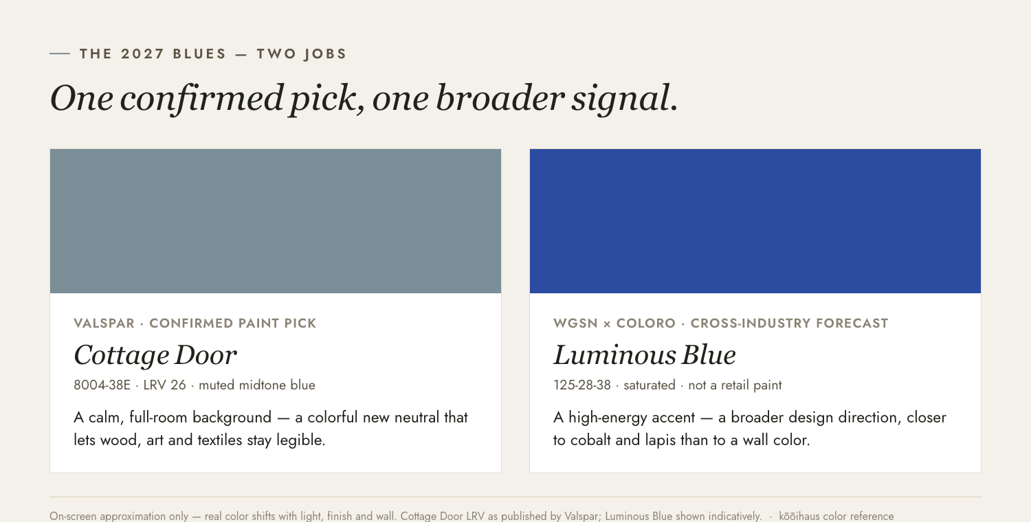
Valspar’s confirmed selection is Cottage Door 8004-38E, a muted blue with an LRV of 26. Its published digital values are RGB 122, 143, 151 and hex #7A8F97, although those screen values should never replace a physical sample.
An LRV of 26 places Cottage Door well below a pale blue or light neutral. It reflects enough light to preserve visible wall planes, but it has enough depth to change the atmosphere of a full room. In weak daylight, it will read grayer and denser. Under warmer evening lamps, its quieter undertones should become more apparent.
That balance is more important than the “cottage” name. This is not a sugary country blue. It behaves more like a softened architectural color: strong enough for cabinetry or a color-drenched bedroom, but restrained enough to sit behind wood, linen, aged metal, and muted pink.
Valspar suggests Moon Shot 8005-2B and Apricot Blush 8003-8A as supporting colors. The useful lesson is the temperature shift. Cottage Door can sit between a warm gray and a dusty pink without forcing the room entirely cool.
Where Cottage Door should work
- A bedroom with cream bedding, walnut, oak, or medium-toned flooring
- Cabinetry set against warm white walls
- A study or reading room with layered artificial light
- A bathroom with stone, brushed nickel, or pale wood
- An exterior door where the blue can be read in natural light
Where it needs caution
A north-facing room with one small window can pull the shade toward cool gray. A flat finish across four poorly lit walls may lose much of its visible variation. Test it on more than one wall and view it after sunset before buying the full quantity.
The verdict is straightforward: Cottage Door is usable because it is a genuine midtone, not because blue has been declared fashionable again.
WGSN & Coloro: Luminous Blue 125-28-38
WGSN and Coloro announced Luminous Blue as their 2027 Colour of the Year in April 2025. Coloro identifies it by the code 125-28-38.
This is not a wall-paint selection. WGSN forecasts across fashion, product design, consumer behavior, and other industries, while Coloro supplies a standardized color system. Luminous Blue therefore belongs in the tracker, but in a separate column from the paint brands.
It is also a much more saturated signal than most of the paint picks below. Cottage Door is designed to function as a purchasable domestic surface. Luminous Blue is intended to indicate a broader direction: an energized blue positioned between natural depth and digital luminosity.
Sherwin-Williams: Celery SW 6421
Sherwin-Williams and HGTV Home by Sherwin-Williams named Celery SW 6421 their 2027 Color of the Year on September 15, 2026. Sherwin-Williams publishes this color’s RGB value as 224, 221, 189 (hex #E0DDBD) on its own color page; the company has not published an LRV for this listing.
Celery is a soft, yellow-green that Sherwin-Williams positions between an airy pastel and a more grounded, herbal green. It is pitched as a wellness-oriented neutral: pale enough to function as a background color, with enough yellow undertone to avoid reading as flat or cold.
The announcement arrived alongside Sherwin-Williams’ 2027 Colormix® Trend Forecast, Rewild — a 48-color palette, including ten “Continuity Colors,” organized around the themes Revive, Reignite, and Reconnect. Rewild is not itself a Color of the Year; it is the surrounding forecast, in the same way past Colormix forecasts have accompanied past Sherwin-Williams selections.
Where Celery should work
- A kitchen or bathroom that wants a fresh, light background without going stark white
- A home office or reading nook paired with warm wood tones
- Trim or cabinetry that wants a pale green rather than another off-white
- A room already anchored by deeper colors — espresso brown, navy, or maroon — where Celery can act as the light note
Where it needs caution
A very pale, yellow-leaning green can shift toward a washed-out chartreuse under strong fluorescent light, and can read as slightly sickly next to a warm-white trim. Sample it against the specific whites and wood tones already in the room before committing to a full wall.
Behr: Grounded T27-01
Behr Paint Company named Grounded (T27-01) its 2027 Color of the Year on August 26, 2026, describing it as a mossy olive green with earthy brown undertones. Behr’s color-detail page was not accessible for verification at the time of this update, so no LRV, hex, or RGB value is published here; that will be added once confirmed directly from Behr.
Behr positions Grounded as a color for “gathering spaces, personal retreats and hardworking rooms” — living rooms, studies, bedrooms, dining rooms, and cabinetry — and it anchors a wider Behr 2027 Color Trends Palette spanning warm neutrals, earthy tones, muted pinks, clay hues, and airy blues.
Where Grounded should work
- A living room or den where a deeper, earthy green can add depth without going dark
- Kitchen cabinetry looking for a sophisticated alternative to navy or black
- A study or bedroom aiming for a calm, grounded mood
Dutch Boy: Deep Rooted 311-7DB
Dutch Boy named Deep Rooted (311-7DB) its 2027 Color of the Year on August 25, 2026. Dutch Boy’s own site lists this color’s hex value as #A6613C — a pigmented, terracotta-leaning orange. The company has not published an LRV for this listing.
Dutch Boy describes Deep Rooted as an earthy orange meant to feel “alive with possibility while being rooted in the familiar warmth of nature,” and pairs it with three companion palettes: Bliss (with Champagne Fizzle and Ribbon Blue), Clarity (with Felted Blue and Timbered Green), and Essence (with Antique White and Western Orange).
Where Deep Rooted should work
- An entryway or dining room that wants warmth without going fully red
- An accent wall paired with cream, antique white, or a muted blue
- Cabinetry or furniture looking for a terracotta note rather than a true orange
Dulux: Soulful Sage
Dulux’s parent company AkzoNobel announced Soulful Sage as its 2027 Colour of the Year on September 8, 2026. Dulux’s own site lists this color’s hex value as #A3A793 (Dulux colour ID 235127) — a soft, grey-leaning green. No LRV is published on this listing.
Dulux describes Soulful Sage as “ethereal, soft and silvery,” and positions it as a flexible base color that can read warm next to earthy tones, restorative next to quieter neutrals, or energising next to brighter accents. It anchors three Dulux colour stories for 2027: Glow, Light, and Lift.
Where Soulful Sage should work
- A living room or bedroom wanting a calm, grey-green neutral rather than a stronger sage
- A kitchen paired with natural wood and warm metals
- A whole-room color-drench for a soft, enveloping effect
Glidden / PPG: Artifact PPG10-16
Glidden, a PPG brand, named Artifact (PPG10-16) its 2027 Color of the Year; the pick was also announced under PPG’s Pittsburgh Paints brand via press release on September 14, 2026. Glidden’s own site lists this color’s RGB value as 105, 128, 139 (hex #69808B) — a warm, smoky, gray-leaning blue. No LRV is published on this listing.
Glidden describes Artifact as a versatile, neutral-leaning blue meant for refreshing a room rather than a full renovation — a “color chameleon” that works across a range of home styles and construction types.
Where Artifact should work
- Interior walls, exteriors, ceilings, accents, doors, or cabinetry looking for a quiet blue reset
- A room that wants a coastal or weathered feel without a strong, saturated blue
- Pairing with the warmer picks on this page — Deep Rooted or Rose Earth — for a grounded, mixed palette
Graham & Brown: Rose Earth
Graham & Brown named Rose Earth its 2027 Colour of the Year. The company’s own product page does not publish a color code, hex value, LRV, or RGB for Rose Earth, and it does not state an announcement date; press coverage places the reveal in September 2026. Those specifics will be added here once confirmed directly from Graham & Brown.
Graham & Brown describes Rose Earth as a warm, grounded pink with soft clay and muted brown undertones, inspired by natural mineral pigments historically sourced from clay deposits in Italy, and frames it as part of a broader shift toward warmer, earthier tones.
Where Rose Earth should work
- A bedroom or living room wanting a muted pink rather than a sweeter, pastel one
- Pairing with clay, terracotta, or warm wood tones
- A single accent wall alongside deeper browns or greens from this list
California Paints: Quiet Peace
California Paints named Quiet Peace its 2027 Color of the Year on September 22, 2026. The company describes it as a deep, moody blue intended to make living rooms, bedrooms, dining rooms, bathrooms, and home offices feel more sheltered without turning the color into a near-black backdrop.
The official announcement does not publish a product code, LRV, hex value, or RGB value for Quiet Peace. That omission matters: the room photography is useful for understanding depth, but it is not a substitute for a physical sample or a measured reflectance value.
California Paints pairs Quiet Peace with softer browns, beiges, greens, yellow, and dusty pink. The practical pattern is contrast by temperature rather than by brightness – a dark blue field with warmer materials and accents that keep the room from becoming visually flat.
Where Quiet Peace should work
- A bedroom or study that benefits from a darker, enclosed background
- A dining room paired with warm wood, brass, linen, or dusty pink
- An accent wall where a full-room application would absorb too much daylight
Where it needs caution
A deep blue can make corners disappear in a room with limited daylight. Test it beside the room’s actual white trim and under evening lamps before deciding whether to use it on one wall or all four.
Clark+Kensington: Vantage Point 38B-4
Ace Hardware and Clark+Kensington announced Vantage Point (38B-4) as their 2027 Color of the Year on September 21, 2026. It is a softened, medium-to-deep blue chosen with Colour Hive and positioned as the focal point of two coordinating palettes, Drift and Mellow.
Drift places Vantage Point near pale, optimistic colors such as Almond Biscotti and Catching Rays. Mellow moves it toward warmer neutrals and earth tones, including Antique White and Adobe Hut. The two palettes make the same useful point: this blue changes character through its neighbors. Pale companions make it clearer and cooler; clay and cream make it feel more settled.
Ace does not publish an LRV, hex value, or RGB value on the official announcement or 2027 trend page. Screen color should therefore be treated as a directional preview, not a mixing specification.
Where Vantage Point should work
- A home office or living room where a mid-depth blue can hold artwork and natural materials
- A bedroom with warm neutral bedding and low-glare lighting
- Cabinetry or a focal wall that needs more color than gray but less saturation than navy
PPG global: Country Soil PPG15-30
PPG announced Country Soil (PPG15-30) as its global 2027 Color of the Year on September 29, 2026. The company describes it as a warm, saturated blend of beige, taupe, and gray with earthy undertones, centered in its Foundations theme and three palettes: Solid Ground, Quiet Zone, and Life Shared.
This does not replace Artifact PPG10-16 in the table above. Artifact is the 2027 selection promoted through PPG’s Glidden and Pittsburgh Paints architectural brands in the United States. Country Soil is a separate global PPG forecast and formula offered through selected architectural brands in EMEA, Latin America, and Asia. Both are official, but they belong to different brand and market programs.
PPG says Country Soil has a low light reflectance value but does not publish the numerical LRV, hex value, or RGB value in the announcement. That makes its role clearer than its exact screen appearance: it is meant to absorb rather than bounce light, creating a quieter background for wood, stone, textiles, art, and stronger accent colors.
Where Country Soil should work
- A living room or bedroom that wants a warmer alternative to gray
- Walls, trim, and ceiling used together for a low-contrast, enveloping scheme
- An exterior palette where taupe needs enough depth to sit beside stone or timber
Where it needs caution
A low-reflectance taupe can become heavy in a small room with one cool-facing window. Pair it with deliberate task lighting and test it against the floor, because warm wood and gray tile will pull it in different directions.
What the 2027 colors mean for real rooms
Eleven confirmed 2027 picks now include five blue directions (Cottage Door, Artifact, Quiet Peace, Vantage Point, and the cross-industry forecast Luminous Blue), three greens (Celery, Grounded, and Soulful Sage), one orange (Deep Rooted), one pink (Rose Earth), and one warm neutral (Country Soil). That spread does not point to a single dominant color. The more durable signal is that muted, earthy midtones — rather than stark neutrals or high-saturation trend colors — are showing up across brands that do not coordinate with each other.
Cottage Door, Artifact, Quiet Peace, and Vantage Point give blue the widest range, from architectural midtone to cocooning depth. Celery, Grounded, and Soulful Sage still function as green-leaning neutrals rather than accent colors. Deep Rooted and Rose Earth supply clearer warmth, while Country Soil makes the beige-taupe family newly visible as an official 2027 direction.
The practical move is still to choose the role before the color:
| Needed role | Better direction |
|---|---|
| Calm full-room background | Muted midtone such as Cottage Door, Artifact, Vantage Point, or Soulful Sage |
| Small visual accent | Clearer, more saturated color such as Luminous Blue or Deep Rooted |
| Warm architectural depth | Clay, Rose Earth, or Country Soil |
| Natural grounding | Moss, olive, or Grounded |
| Flexible long-term base | Warm-leaning green such as Celery |
A forecast is most useful as permission, not instruction. It can show that a muted green or a warm terracotta is entering the mainstream without proving that either belongs in your room.
If you are comparing these early signals with established neutral options, the Kooihaus guide to the best neutral paint colors explains the quieter end of the spectrum.
How this tracker will be updated
Each new entry will record:
- Company and color name
- Official code
- Announcement date
- LRV when the brand publishes it
- Color family and undertone
- Whether it is a paint, product-design forecast, or broader color standard
- The practical rooms and lighting conditions it is most likely to suit
A brand moves from “Waiting” to “Confirmed” only when it names a specific color as its own 2027 Color or Colour of the Year. Forecast palettes, like Sherwin-Williams’ Rewild before September 15, stay labeled as forecasts until that happens.
Frequently asked questions
What is the official Color of the Year 2027?
There is no single, universal Color of the Year. As of September 30, 2026, eleven organizations tracked here have made an official 2027 announcement: Valspar (Cottage Door), WGSN & Coloro (Luminous Blue, cross-industry), Sherwin-Williams (Celery), Behr (Grounded), Dutch Boy (Deep Rooted), Dulux (Soulful Sage), Glidden/PPG (Artifact), Graham & Brown (Rose Earth), California Paints (Quiet Peace), Clark+Kensington (Vantage Point), and PPG global (Country Soil).
Has Sherwin-Williams announced its 2027 Color of the Year?
Yes. Sherwin-Williams and HGTV Home by Sherwin-Williams named Celery SW 6421 as their 2027 Color of the Year on September 15, 2026, alongside the 48-color Rewild Colormix trend forecast.
Why does PPG have two 2027 colors in this tracker?
Artifact PPG10-16 is the 2027 selection promoted through PPG’s Glidden and Pittsburgh Paints brands in the United States. Country Soil PPG15-30 is PPG’s separate global 2027 Color of the Year for selected architectural brands in EMEA, Latin America, and Asia. The programs overlap at the parent-company level but are not the same market announcement.
Has Pantone announced its 2027 Color of the Year?
No official Pantone Color of the Year 2027 has been published as of this update.
Is Cottage Door a light blue?
No. Its LRV is 26, which makes it a mid-to-dark muted blue rather than a pale or highly reflective shade. Its appearance will depend heavily on daylight and artificial lighting.
The 2027 season has now produced eleven official picks across paint and design programs, plus five tracked brands still to announce. The clearest direction is not one winning hue but a move toward quiet blues, softened greens, and earth-derived neutrals that can carry a full room without behaving like a bright accent. This page will keep the confirmed and waiting columns updated as the remaining brands announce.









 Blankets and Throws
 Home Accessories
 Furniture
 Rugs
Rugs Cushions
 Kitchen
 Cutlery and Dinnerware
 Drinkware
 Table Mats and Coasters
 Dining Accessories
 Tablecloths and Napkins
 Decorative Items
 Vases and Planters
 Wall Decor
 Bathroom Accessories
 Bathroom Storage
 Bath and Shower Mats
 Towels