FREE WORLDWIDE TRACKED SHIPPING
IKEA VARPTROSS Lighting: Why the New Bamboo Collection Matters
 By Alex Carter
IKEA VARPTROSS uses layered bamboo slats to soften glare and turn affordable lighting into a warmer architectural element.

© Inter IKEA Systems B.V. 2026. Source: IKEA Newsroom. Used for informational/editorial coverage.
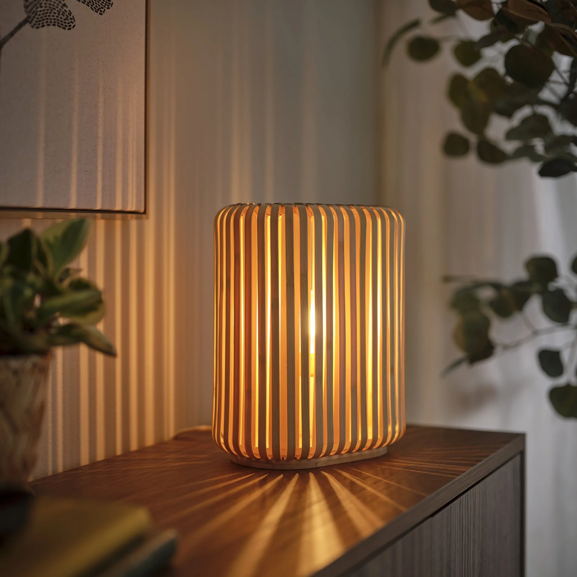
VARPTROSS is interesting because it treats an affordable lamp as a piece of spatial texture. The layered bamboo does more than signal natural style: it moderates the view of the bulb, casts changing shadow and gives one design language four useful scales.
This is an editorial assessment based on the official launch information and the current design context, not a hands-on product test. Availability, price and specifications can vary by market, so verify the local product page before purchasing.
Featured image: © Inter IKEA Systems B.V. 2026. Source: IKEA Newsroom. Used for informational/editorial coverage.
What is confirmed
- IKEA announced VARPTROSS on June 22, 2026 and set the global launch for July 1, 2026.
- The collection includes floor, pendant, wall and table lamps.
- Designers Andreas Fredriksson and Akanksha Deo developed the collection around double-layered bamboo slats intended to reduce glare and create depth.
- IKEA describes bamboo variation as part of the visual character rather than a defect.
The distinction between confirmed facts and interpretation matters. Launch materials tell us what exists and how the brand positions it; they do not prove long-term durability, comfort or value. The analysis below therefore focuses on design logic, room fit and questions a buyer can verify independently.
The quick design read
| Area | What matters | Practical check |
|---|---|---|
| Pendant | Dining table, kitchen island, central zone | Check hanging height and sightlines |
| Wall | Bedside, hallway, compact corner | Check cable and switching plan |
| Table | Sideboard, desk, bedside surface | Protect usable surface area |
| Floor | Reading corner, living room ambience | Keep base clear of circulation |
The double layer is the real design move
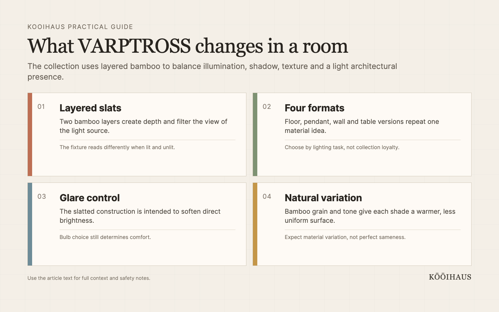
Slatted shades are familiar, but the second bamboo layer makes the silhouette more complex and changes how directly the eye meets the light source. When the lamp is off, it reads as a warm, graphic object. When it is on, overlapping strips produce depth and patterned shadow. That dual identity matters in small rooms, where one fixture often has to provide both atmosphere and visual structure.
The practical test is whether this idea improves light, circulation, maintenance or comfort in a real room. It should not be adopted solely because it appears in a new collection or forecast. Measure the space, compare the material and keep enough visual quiet for the design move to register.
Four formats make the idea testable
The pendant can anchor a dining table or reading zone from above; the wall version can introduce texture without consuming floor area; the table lamp brings the material close to eye level; and the floor lamp can act as a taller ambient source. Buying the whole family is unnecessary. The strongest choice is the format that solves an actual dark corner, task or circulation constraint.
The practical test is whether this idea improves light, circulation, maintenance or comfort in a real room. It should not be adopted solely because it appears in a new collection or forecast. Measure the space, compare the material and keep enough visual quiet for the design move to register.
Bamboo changes the palette without demanding more color
Pale and honeyed bamboo can warm white walls, gray upholstery and black metal without adding another painted accent. It is especially useful in Japandi and contemporary rooms that risk feeling too smooth or showroom-like. The material brings grain and irregularity, but the repeated linear geometry keeps it disciplined rather than rustic.
The practical test is whether this idea improves light, circulation, maintenance or comfort in a real room. It should not be adopted solely because it appears in a new collection or forecast. Measure the space, compare the material and keep enough visual quiet for the design move to register.
Glare still depends on the bulb and placement
A shade can soften the view of a bulb, but brightness, color temperature and mounting height still determine comfort. A high-output cool bulb can undermine the collection’s warm character. For dining and evening rooms, begin with a dimmable warm source where compatible, then evaluate the fixture from seated eye level. Follow the product instructions for bulb type, wattage and clearance. For a practical Kelvin comparison, see our guide to choosing dining room color temperature.
The practical test is whether this idea improves light, circulation, maintenance or comfort in a real room. It should not be adopted solely because it appears in a new collection or forecast. Measure the space, compare the material and keep enough visual quiet for the design move to register.
The broader IKEA 2026 pattern is tactile function
VARPTROSS sits beside other 2026 IKEA launches that emphasize playful function, material presence and lighting as atmosphere. HÅLGATT uses ceramic bases and textile shades; IKEA PS 2026 foregrounds adaptable, expressive objects. The common thread is not one style but a move away from anonymous utility toward affordable pieces that visibly shape a room.
The practical test is whether this idea improves light, circulation, maintenance or comfort in a real room. It should not be adopted solely because it appears in a new collection or forecast. Measure the space, compare the material and keep enough visual quiet for the design move to register.
How to use the idea without copying the campaign
Start with the room’s existing problem. If the issue is flat, cold light, test a more tactile shade or a second lower light source. If the issue is a visually noisy small bedroom, choose one patterned anchor and make the surrounding layers quieter. If the room lacks warmth, add one material with visible grain or weave before changing the entire palette.
Photograph the room in daylight and at night. Campaign imagery is optimized for a particular angle, exposure and styling density; your room must work from several viewpoints and under ordinary bulbs. A two-day mock-up with existing objects often reveals whether the trend is solving the problem or merely changing the photograph.
What to verify before buying
- Exact dimensions, material composition and care instructions.
- Market-specific price, availability and return conditions.
- Bulb, power, installation or mattress compatibility where relevant.
- Whether the product remains useful after the coordinated collection or trend moment passes.
- Whether one item can provide the intended effect without requiring a full room reset.
Translate the launch into a room decision
New collections compress many choices into one persuasive image: material, palette, lighting, styling and a narrative arrive together. Separate them before deciding what you actually like. Save the image, then list its components without brand names. You may discover that the useful idea is a low warm lamp, a single patterned duvet, a darker wood tone or a movable side table rather than the featured product itself.
Next, compare the idea with what the room already owns. Reusing an existing lamp with a better bulb, rotating bedding between seasons or moving a textured object into a flatter room may deliver most of the effect. If a purchase remains justified, define its role and maximum dimensions before browsing local availability. This protects the room from becoming a sequence of unrelated launches.
Allow time to test visual novelty. A product that feels exciting on announcement day can feel loud once it occupies a small room every morning. Place a similarly sized object or textile in the intended position for forty-eight hours. Note circulation, reflected light, cleaning access and whether the rest of the room suddenly demands more changes. Good design reduces friction; it should not create a chain of corrective purchases.
Finally, retain the packaging, care details and order record until the item has been inspected in real light. Check finishes, seams, stability, electrical compatibility or textile dimensions as appropriate. Editorial enthusiasm is useful for discovering possibilities, but the buyer’s job is to verify the specific object that arrived.
Frequently asked questions
When did IKEA VARPTROSS launch?
IKEA announced the collection for July 1, 2026, subject to market availability.
Who designed VARPTROSS?
IKEA credits Andreas Fredriksson and Akanksha Deo.
What is the collection made from?
The defining shade material is bamboo arranged in two overlapping slatted layers.
Is VARPTROSS good for Japandi interiors?
Its natural material and restrained geometry fit easily, but the room still needs contrast, appropriate scale and a comfortable bulb rather than a collection-based theme.
Bottom line
The news is worth attention when it points to a durable design principle: better light control, useful coordination, honest material, adaptable function or a warmer relationship between objects. Treat the launch as evidence of a direction, then make the smallest change that improves the room on its own terms.










 Blankets and Throws
 Home Accessories
 Furniture
 Rugs
Rugs Cushions
 Kitchen
 Cutlery and Dinnerware
 Drinkware
 Table Mats and Coasters
 Dining Accessories
 Tablecloths and Napkins
 Decorative Items
 Vases and Planters
 Wall Decor
 Bathroom Accessories
 Bathroom Storage
 Bath and Shower Mats
 Towels