FREE WORLDWIDE TRACKED SHIPPING
Behr Grounded 2027 Can Rescue a Beige Room—If You Test It First
 By Laura Jones
Behr Grounded 2027 is a brown-leaning olive that can connect beige, gray, and warm wood—if the room has enough contrast.
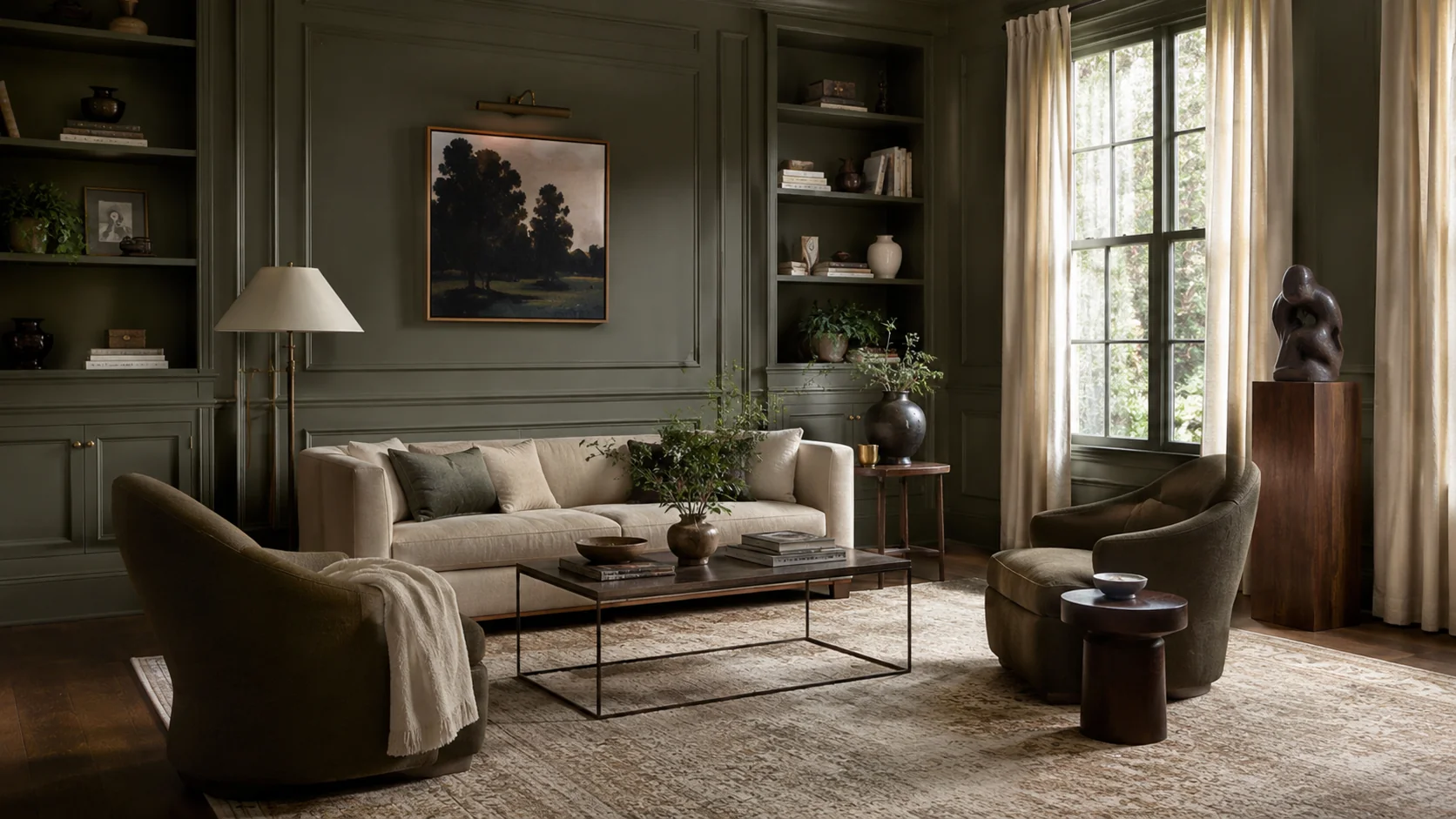
Illustrative image by Kooihaus — not official Behr photography. The olive-green room is visual context, not a representation of Behr Grounded.
Hold an olive paint chip beside a beige sofa and the room usually tells you the truth quickly. The right green makes the upholstery look warm and deliberate; the wrong one makes both colors seem tired.
That is the useful test for Behr Grounded 2027, not whether it looks serene in a campaign photograph. Behr’s new Color of the Year is a mossy olive with enough brown underneath to connect cream upholstery, wood floors, old brass, and even the gray sofa that is not going anywhere. Its strength is not novelty. It is repair.
Featured image: Kooihaus illustration, not official Behr photography.
What Behr Actually Announced
Behr announced Grounded (T27-01) on August 26, 2026, as its 2027 Color of the Year and the anchor of its wider 2027 Color Trends Palette. The company describes it as a color moving between moss and olive, held down by earthy brown undertones. It is also a new shade rather than a renamed color from the existing deck.
The timing matters because this is Behr’s tenth Color of the Year. The program started in 2018 with In the Moment, moved through warm white, red, soft black, smoky jade, and several nature-led greens, and has now arrived at a color that is almost a neutral without pretending to be beige. Our broader Color of the Year 2027 tracker follows the other brand announcements; this piece is about what Grounded asks you to do in an actual room.
Behr gives Grounded the digital reference #5E5C50. That value is useful for comparing the official palette on a screen, but it is not a paint match. Displays, sheen, substrate, and room light all change the result, which is why the sample step belongs before the shopping list.
The Brown Undertone Is the Whole Story
The easiest mistake is to file Grounded beside the soft gray-green sages that have filled interiors for several years. It is heavier, browner, and more willing to sit beside imperfect existing finishes.
In independent reporting for ELLE Decor, Behr color lead Kayla Kratz explained that the team tested many olive variations before choosing a version with less blue and more brown than 2026’s Hidden Gem. That difference is practical. Blue-green often sharpens the contrast with honey oak, camel leather, or warm beige. A brown-leaning olive can connect them.
This is the non-obvious value of Grounded: it can make an older neutral room feel intentional without requiring every neutral to be replaced. The wall becomes the middle term between cool gray and warm wood. That is more useful than another promise that a paint color will bring nature indoors.
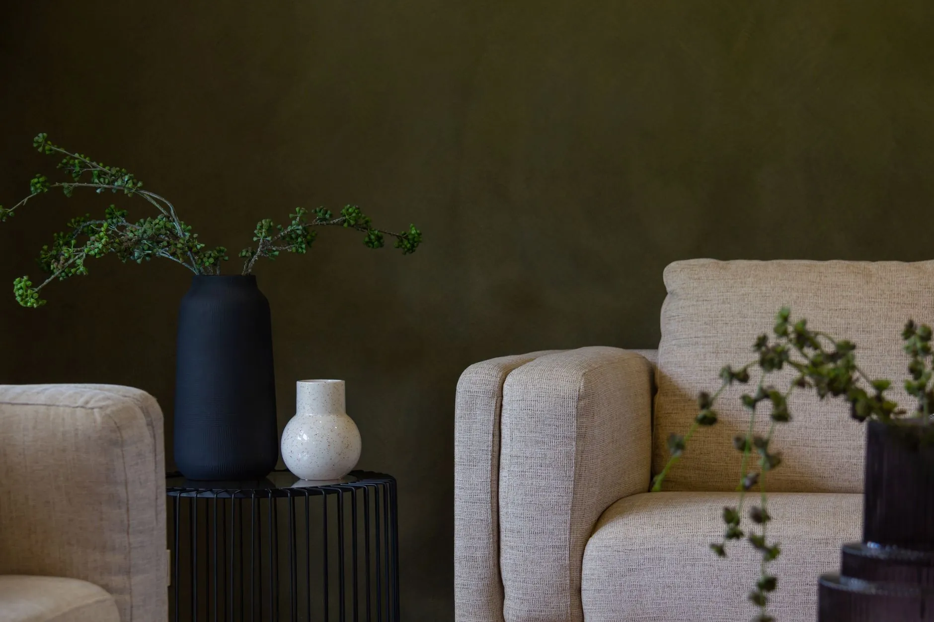
Where Grounded Works Best
Grounded has enough visual weight to define a surface, so placement matters more than square footage. A small room is not automatically a bad candidate, and a large room is not automatically safe.
| Placement | Why it can work | Main risk | Best test |
|---|---|---|---|
| Living-room walls | Connects cream upholstery, dark metal, warm wood, and muted textiles | Can turn flat when every other finish is also brown | Place the sample behind the largest fixed item, usually the sofa |
| Kitchen cabinets | Gives plain cabinetry depth and works well with wood, brass, copper, and off-white tile | Cool white counters can make the olive look dirtier than expected | Test beside the counter, backsplash, and floor at the same time |
| Built-ins or trim | Adds architecture without covering every wall | A narrow painted outline can look accidental if the wall color is too similar | Compare full trim-plus-shelf treatment with a single accent panel |
| Bedroom walls | Creates a quiet, enclosed backdrop for linen, wool, and wood | Low light may push it toward brown rather than green | Check the sample in morning light and with the bedside lamps on |
| Front door or exterior detail | Sits naturally beside stone, brick, and timber | Foliage can swallow the color instead of contrasting with it | View the sample from the street, not only from arm’s length |
For a room that already contains cream, walnut, black, or aged brass, the all-wall option is worth testing. For a room with bright white millwork, blue-gray flooring, and cool lighting, start smaller. A door, built-in, or cabinet bank lets the color create a center of gravity without asking the whole room to cooperate.
Where It Can Go Muddy
Brown undertones make Grounded adaptable, but they also create its failure mode. When the light is weak and every surrounding material is warm, the green can lose separation. Olive wall, beige sofa, tan rug, oak floor, and yellow lamp light may produce one long midtone with no edge.
The fix is contrast, not more decor. Give the room one pale plane, one dark line, or one cooler counterpoint. That might be a creamy ceiling, a near-black lamp, a dusty blue chair, or a white stone surface with visible movement. If you are already planning a dark bedroom, the same rule applies: deep color needs readable edges and light on the walls, not just a brighter bulb in the middle of the ceiling.
Grounded is also less forgiving beside yellow-beige paint than beside natural wood. Wood has grain and variation; flat yellow-beige can make a brown olive look stale. Put the two samples together before deciding that the existing wall or hallway color is neutral enough to ignore.
The Best Pairings Are Not More Green
Behr’s 2027 palette includes several greens, but a Grounded room does not need a forest of near-matches. The more useful pairings create a clear job for the olive.
- Grounded + Coastal Beige (
#F0EBD9) gives you a warm light surface without a harsh white outline. Use the cream on ceilings, curtains, or a neighboring room. - Grounded + Tuscan Terra (
#784D40) makes the palette warmer and more material. Terracotta, rust, leather, and clay belong here. - Grounded + Blue Moon Bay (
#588496) adds a cooler note that stops olive and beige from collapsing into one brown field. A chair, artwork, or small cabinet is enough. - Grounded + Nightfall (
#45494D) creates a dark structural line for hardware, lighting, frames, or a small piece of furniture.
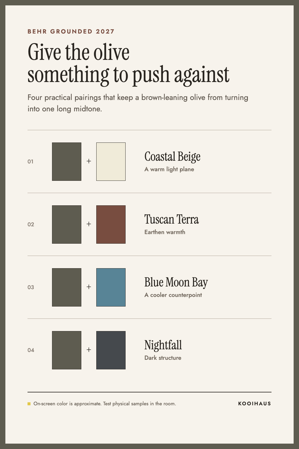
These on-screen swatches are approximate, not calibrated paint samples. The useful information is the relationship: pale warm neutral, earthen accent, cooler blue, or deep charcoal. Pick one contrast family and repeat it twice. A room does not improve because every color in the trend palette was invited.
If your home already leans Japandi, Grounded can replace some of the predictable sage without breaking the material logic. Keep the restrained woods and warm whites from a Japandi color palette, then let the olive carry more depth than decoration.
How to Use Grounded Without Repainting the Whole Room
Color of the Year coverage often assumes the wall is the only meaningful canvas. In practice, the best use may be the part of the room that needs definition.
Paint a bookcase and the wall behind it as one mass. Use Grounded on lower cabinets while keeping uppers and walls light. Carry it across a door and its casing so the opening reads as an object rather than a leftover. In a rental, use the color as a target for a large removable panel, curtain, or painted freestanding cabinet rather than trying to find five small olive accessories that almost match.
The partial approach works because Grounded is dense enough to create a visual pause. It does not need to appear everywhere. In fact, scattering similar greens around the room can weaken the effect by turning a specific olive into a theme.
Readers comparing it with more conventional choices should also look at our guide to the best neutral paint colors. Grounded is not a neutral in the strict sense, but it can do a neutral’s job when the room needs more depth and less gray.
The Sample Test I Would Use
Behr offers both an 8 oz. paint sample and a 9 x 15 inch peel-and-stick sample. Either is more useful than matching the website image on a phone.
Use the sample against the room’s fixed materials, not on an empty patch chosen for convenience. Check it behind the sofa, beside the kitchen counter, near the floor, and close to the trim. Then look at it in the morning, in the strongest daylight the room receives, and again with the evening lights you actually use. The same camera-first habit can help you preview a wider décor change before buying anything.
Ask three plain questions:
- Does it still read green when the lamps are on?
- Does it make the beige, gray, or wood beside it look better?
- Is there enough light-dark contrast for the room’s edges to remain visible?
If the answer to the second question is no, the color is not repairing the room; it is adding another compromise. If the green disappears at night but you like the darker mood, that is a valid choice. Make it knowingly.
The Verdict
Grounded is a strong 2027 choice because it does not demand a clean slate. Its brown undertone can pull an ordinary mix of beige upholstery, gray leftovers, warm wood, and dark metal into one room with a point of view.
Use it when the room needs an anchor and already has at least one light surface and one clear contrast. Skip the full-room treatment when every fixed finish is warm, midtone, and close in value. In that case, paint the cabinet, built-in, or door first.
The trend is optional. The sample is not.
Sources: Behr corporate announcement and Behr’s Grounded room-and-sampling guide.











 Blankets and Throws
 Home Accessories
 Furniture
 Rugs
Rugs Cushions
 Kitchen
 Cutlery and Dinnerware
 Drinkware
 Table Mats and Coasters
 Dining Accessories
 Tablecloths and Napkins
 Decorative Items
 Vases and Planters
 Wall Decor
 Bathroom Accessories
 Bathroom Storage
 Bath and Shower Mats
 Towels